The Science and Recent History of Bookstore Design
In December 2021, Architectural Digest published a feature article about a new bookstore that opened in China’s Shenzhen region. It is a fascinating structure, with a glass-heavy entrance and a literal spiral bookshelf. It is a whimsical, modern bookstore design and unlike anything I’ve ever seen. Designed by a Shanghai-based firm called X+Living, the designers wanted to “pay homage to the transformation and progress of the city through design.”

Almost 40 years earlier, in 1982, designer Ken White was asked to design the new location of the Gothic Bookshop at Duke University, located in Durham North Carolina. White wanted the bookshop to reflect the gothic-style buildings of the university. He used custom-designed and hand-carved wood, having been inspired by his research of medieval churches. With this, White created a truly remarkable bookstore experience, and he went on to co-author a book on bookstore design titled Independent Bookstore Planning and Design.
Many of White’s concepts (e.g. how a bookstore should “reflect the style and tradition of its surroundings”) ring true for many independent bookstores today. Both White and the designers of X+Living were inspired by the location around the bookstore and the traditions of each respective community. With the rise and dependency of Amazon — and weathering another year of a pandemic — bookstore design continues to modernize and adapt, though the core concepts remain the same.
Bookstore Design in the Age of Borders and Barnes & Noble
James Daunt is Chief Executive Officer of Barnes & Noble, the world’s largest retail bookseller, and of Waterstones, the largest retail bookseller in the United Kingdom. Over a video interview, Daunt described chain bookstores in the age of Borders and Barnes & Noble (B&N) as cookie cutter. In the 1990s and early 2000s, it was less about the browsing experience and more about having the stock customers were looking for.
“In the past, you assumed the customer knew what they wanted,” he said. Having any type of intellectual or emotional experience wasn’t considered. Additionally, there was much less emphasis on lighting and shelf measurement, and the materials were less organic.
“My predecessors would have wanted everything in a straight line,” he said. “[They] used metal and paint. I find that not organic.”
Bookseller Power: Then & Now
Booksellers also had less power on where books were placed in the store than they do now. There was more “commercial dance” between publishers and the stores on product placement. “How much are you you going to pay me?” was a common question between the administrative office and publishers on where books were placed.
“That isn’t how it works anymore,” Daunt said. “Now you get a nice little note on how fabulous a book is, and we’ll read it, and if it’s great, we’ll put it out. It’s entirely up to the booksellers. Our job is make it as easy as possible for them to make the right decisions.”
It took time to understand the power and influence of good booksellers.
“You need booksellers that can put those books in front of people,” Daunt said. “We didn’t have a breadth of idea that we needed to do that two years ago. We thought were just racking up books so we had what you wanted. But that’s not the game that you wanted. The indies have always understood that.”
With the rise of Amazon, customers who knew precisely what books they wanted could now easily retrieve them. Not only did that factor into the closing of Borders and many other B&N locations, it also required that the surviving chains look to what independent bookstores do best and have always been doing: Catering to their customers’ interests and the needs and values of the surrounding community.
Lighting and Shelves in Bookstore Design
For independent bookstores, lighting and space has always been important. Bright lighting is important (you’re reading, after all), but natural light was and still is a priority for independent bookstores. What used to be clear, straight paths with singular shelves in B&N is now much more varied, something that independent bookstores have been doing for a while.
Lighting Is Crucial
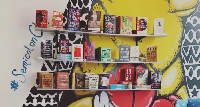
When designing the space for Semicolon Bookstore & Gallery, a Black woman–owned bookstore and gallery space Chicago, owner D.L. Mullen aimed for a calm experience.
“Our design grabs readers by having created a plethora of open space for readers to roam,” she said. “My favorite space in my bookstore is the seat in the corner next to our front window. It gets all of the sunlight throughout the day and I love being able to see and speak to the people who are walking in!”
Much like White’s concept to reflect the style and tradition of surroundings, Mullen said she was inspired by places she loves to frequent (bars, museums, and libraries) to form a “cohesive experience.”
“I wanted it to feel as homy and inviting as possible, which is why I used a ton of plants, candles, rugs, and comfortable seating.”
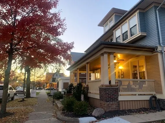
In 2021, the independent bookstore Wild Geese Bookshop in Franklin, Indiana, moved to a new location in the same area. I now work as a bookseller at the new location, which originated as a hotel built in 1911. Owner Tiffany Phillips knew lighting was central when creating her new space.

“My vision was to make sure it still felt like a home with warm glowing light, rooms that fit the architecture and functional furniture pieces that mirrored the style of the house,” she said. “I like to listen to what the space offers already and let the things that really work guide some of the decisions.”
Like independent bookstores, Daunt said lighting is much more of a science when designing Barnes & Noble spaces.
“Lighting is crucial,” he said. “In the old days, they didn’t really [think about light]. Nowadays, you want the science of your lighting to work. You need a natural light that doesn’t feel like an airport terminal.”
Prioritizing the Customer with Shelving
And instead of a straight line, B&N now puts much more emphasis on shelving variations and what shelves fit the right books.
“I want [the shelf] to be as full as possible,” Daunt said. “I have to have adjustability, and also how deep is my shelf? I want the right shelf for the right book. We have three sizes of shelves.”
At Semicolon, shelving is key.
“We did away with ‘normal’ store shelf design and made a point to create bright, customer-facing shelves,” Mullen said. “We prioritize the feeling of calm, above all, instead of putting the reader into an overwhelming mental space via overfilled shelves.”
Wild Geese Bookshop took White’s concept of surroundings to another level, utilizing the kitchen space in the shop to shelve cookbooks and other cooking and food-themed merchandise.
“There’s a kitchen in the house, so naturally I had to think about cookbooks, food writing, gardening, and crafts in that space,” Phillips said. “Kitchens are so often the heart of a house, so I wanted ours to feel like coming home after a long journey.”
Creating the Intellectual and Emotional Experience
Barnes & Noble locations have had to adapt, especially with the pandemic, to create a better experience for customers. A book found in stores is identical (save for maybe signed or special editions) to what is found online. The difference is the location in which the book is found.
“The modern bookstore is about an intellectual browsing environment throughout the store,” Daunt said. “Our job, when you come into our stores, it’s just fun, it’s exciting, you walk out with books you had no idea that you needed, wanted, and feel really good about it.”
Reorganizing Bookstore Design During the Pandemic
In March 2020, while many cities were on lockdown for the pandemic and stores closed to the public, Daunt had B&N locations use the time to reorganize.
“We told them just to take everything off the shelves and organize it in a way that’s more interesting,” Daunt said. “When we reopened, we had different stores, and our sales went up. Some stores did it brilliantly, most did it well.”
What is interesting is that the stores were given a lot of creative freedom when organizing, allowing them to cater to the interests of their community. Some locations had shelves upon shelves of manga. Locally, I’ve noticed that the B&N in Greenwood, Indiana, has expanded its science fiction and fantasy shelves, separating the genres and allowing them to take up an entire wing of the store.
Daunt said the B&N stores that didn’t succeed as well in the reorganizing took help from sister B&N locations close by.
“Good bookstores always borrow off other ones,” Daunt said.
Prioritizing Safety and Health Through Design
At Wild Geese Bookshop, Phillips believes staff experience is just as important as the customer experience, and they influence each other. This was just as important in the new space.
“I also prioritize balancing staff and customer safety with feeling at home in a space,” Phillips said. “I wanted this location to also give customers a bit of distance between each other for their health and also for peace of mind and we were grateful to work with Franklin Heritage, the owners of the property, to build a ramp and ADA sized restroom for guests.”
The Science Continues
Bookstores, indie and chain alike, have continuously had to adapt to the customer experience, especially so in the last few years. Those that cannot adapt often close, though having a bookstore located in cities ideal for book lovers never hurts.
Whether it be creating a calm space for readers, adapting a historical building to your bookstore’s needs, or having an entire chain reorganize, the science of bookstore design continues to evolve, though it almost always takes influence from its respective communities. And the efforts by owners and booksellers alike to create a cohesive bookstore design always brings out the best possible customer experience.
“If you pay attention to the details as a creator of experiences,” Phillips said, “guests sense that they are special and worth careful consideration, too.”


