Representation of Wheelchair Users On Book Covers: Still a Long Way To Go
When I was growing up as a disabled kid, I read disability representation in books ranging from sparse to blatantly ableist and dehumanizing. In 2016, Corinne Duyvis and Kayla Whaley of Disability in Kidlit broke down representation of several different kinds of disabilities on kids’ book covers. They highlighted Laughing at My Nightmare, humorous YA nonfiction by Shane Burcaw.
The best covers show a range of diverse, disabled people or characters and how their disabilities affect them. Some disabilities are less visible than others. So, depicting disability accurately means it might not be obvious when characters are disabled. Duyvis and Whaley distinguished this fact from the artistic choice to minimize or hide a character’s disability: to blend it into the background or symbolize it.
In 2017, Carrie at Autostraddle hilariously satirized stock photos of disability, especially images meant to be “inspirational.” These stereotypical images, such as “overcoming” disability, or equating all disabilities with manual wheelchair use, make their way onto book covers as well. If few accurate references are available in 3D and photo databases, that can exacerbate the stereotypes and inaccuracies.
Since 2016, many more books have been published by disabled authors, featuring disabled characters, or with wheelchair users on the covers. I also loved seeing disabled students and hearing the phrase wheelchair user on Abbott Elementary.
I use mobility aids but rarely use a wheelchair. So, I asked some wheelchair users for their opinions on books with wheelchair users on the covers. I asked about trends they’d noticed, their favorite and least favorite covers, and why they like or dislike them. Are there common inaccuracies or stereotypes on covers featuring wheelchair users? How can these covers be improved?
The Covers We Like
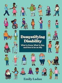
Demystifying Disability: What to Know, What to Say, and How to Be an Ally by Emily Ladau
Emily Ladau, an activist and author, told me she consciously put diverse disabled people, including several wheelchair users, on the cover of her 2021 nonfiction book. Tyler Feder illustrated the cover. “I’ve noticed maybe a few books with wheelchair users on the front, but the ones that come to mind are all somehow disability-related — written by disabled authors and/or about disability,” Ladau wrote to me.
She added: “On the rare occasion I have seen a wheelchair on [a] book cover, I feel like it’s been a very hospital-esque version, which isn’t an accurate representation of the diversity of types of wheelchairs at all.”
This is a great point. There are a lot of hospital wheelchairs on book covers, and not all wheelchair users use that style. For medical reasons, many people need customized wheelchairs, but there can be financial and/or insurance reasons why they use hospital-style wheelchairs instead. It’s always best to show the diversity of disabled people, instead of assuming we’re all the same in any way.
Autumn Wise described herself to me as a “wedding planner, power wheelchair user, and funny Goth in training.” She said she sees wheelchair users on book covers now “more than I saw growing up, but I’d be quick to point out that it doesn’t expand equally across many age groups, genres, or other axes of diversity. Most of the covers with wheelchairs/wheelchair users on the cover exist in the children’s books or nonfiction space with white folks centered in the imagery. In summary, there have been minor improvements in visual representation, but the book cover design industry still has a long way to go to give us the rep we deserve across all channels of diversity.”

Laughing at My Nightmare by Shane Burcaw
Like Corinne Duyvis and Kayla Whaley, Autumn Wise loves Laughing at My Nightmare and gives specific reasons why this cover works. The cover photo is by Matt Carr, with cover design by Andrew Arnold. “It works well because the book’s color scheme and design itself is simple, with Shane and his disability being the true focal point. I also like that it shows Shane’s body in its natural position (leaning to one side, fingers contracted, leg height discrepancy, etc.) and doesn’t try to make his appearance more ‘palatable’ for the able-bodied viewer. Lastly, I love the speech bubble with the expletive and his facial expression on the cover. It shows that disabled folks are capable of being funny, cussing, etc. It doesn’t shy away from the fact that Shane is an adult, with adult experiences, and adult language, so it helps break the pattern of infantilizing/patronizing disabled folks that we see so often by able-bodied folks and the mainstream media.”
Like Emily Ladau, Autumn Wise thinks that a lot of covers show manual, hospital-style wheelchairs because non-disabled people are probably most familiar with those. Autumn clarified: “Not just any manual chairs, but the generic ones you find in a clinical setting that aren’t properly fitted to the individuals’ bodies.”
She also explained another misconception that some non-disabled people may have about wheelchair users and why they may relate more to manual chair users. Some people may assume mistakenly that manual wheelchair users are more “active” or “independent” and power chair users are more “passive.” As I said earlier, every person’s disability affects them differently. Reviewers often criticize marginalized characters’ lack of “agency.” Being unable to push oneself in a wheelchair, walk, or speak, for example, should never be conflated with autonomy or agency, even in fiction. Autumn said: “In my experience, people treat independence as some kind of disability worth token, that only if you’re completely independent, are you a worthy disabled person.”
Autumn pointed out that many people customize their wheelchairs, which would be great to see more often on covers. “Give us powerchairs with cool features, like stickers on the back, or a fun joystick, or a sporty manual wheelchair with some cool hot pink rims, anything to give our wheelchairs some personality. They are an extension of our bodies. Treat them as such!” she said. She added that with covers with wheelchair users, the disabled characters should be important to the story, not just used to inspire non-disabled readers: “You shouldn’t see yourself represented on the cover of a book, only to then read a story that teaches you that your only value comes from inspiring others.”
Here are some of my favorites:

Disability Justice A to Z: A Coloring Book for Our Communities by Sins Invalid
I’m a fan of Sins Invalid, a group of performers and activists led by LGBTQIA, disabled people of color and based in the San Francisco Bay Area, and I’m also a fan of coloring books. When they recently published their Disability Justice A to Z Coloring Book, I had to buy it. All the art is by 26 disabled, queer artists of color, listed at the link above. I love seeing a powerchair user on the cover and that the spaces are big and fairly easy for me as a disabled person to color.

Beauty is a Verb: The New Poetry of Disability edited by Sheila Black, Jennifer Bartlett, and Michael Northen
I also love the cover of this poetry anthology from 2011, written and edited by disabled poets. Full disclosure: when Michael Northen was the editor of the online literary magazine Wordgathering, he published some of my work, but I would have recommended this book and its cover anyway. The book and cover design are by JB Bryan. The surreal cover image is titled Portal and is a photo of a performance by disabled artist Sue Austin.
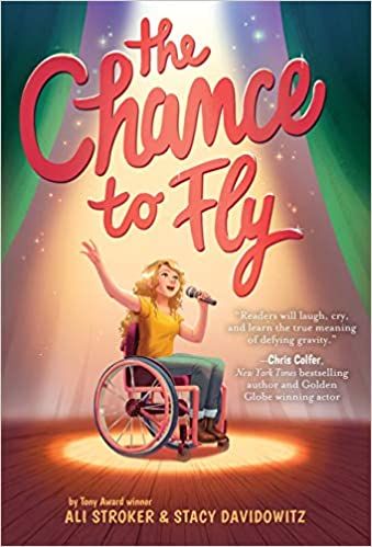
The Chance to Fly by Ali Stroker and Stacy Davidowitz
Ali Stroker, who became the first wheelchair user to win a Tony Award in 2019, has also published two kids’ books. The Chance to Fly is a middle grade novel co-written by Stroker and Stacy Davidowitz, with cover illustrations by Maike Plenzke and design by Marcie J. Lawrence. Ali and the Sea Stars is a picture book written by Stroker and illustrated by Gillian Reid, with cover art by Reid and cover design by Chelsea C. Donaldson.
I love these because the characters look happy and passionate about performing. Inspiration is a loaded word in the disabled community. However, when an award-winning singer and actor who uses a wheelchair puts wheelchair users on the cover of her book, that’s inspirational in a totally different way from non-disabled people labeling us as inspirational.

The Girl from Aleppo: Nujeen’s Escape from War to Freedom by Nujeen Mustafa and Christina Lamb
This 2017 memoir is by Nujeen Mustafa and co-authored by journalist Christina Lamb. Mustafa, a Kurdish Syrian activist with cerebral palsy, traveled from Syria to Germany as a teenage wheelchair user and refugee during the Syrian Civil War. This edition shows Mustafa in her wheelchair on the cover. Photos are courtesy of the Mustafa family collection.

The Oracle Code by Marieke Nijkamp and illustrated by Manuel Preitano
This is a 2020 graphic novel written by Marieke Nijkamp and illustrated by Manuel Preitano. Preitano is also the cover artist, and the bold lines and colors fit this DC, YA superhero graphic novel perfectly. Barbara Gordon is in her wheelchair with her face hidden and one hand in a fist. It’s a compelling introduction for a story about a teen finding new strengths after being paralyzed. Even the font looks like a command prompt on a computer.

Can’t Escape Love by Alyssa Cole
This is a 2019 romance novella from Cole’s Reluctant Royals series. It’s a romance between Reggie, a Black woman who uses a wheelchair, and Gus, an East Asian man who many readers interpret as neurodivergent. The cover design is by Nadine Batalaty, photographed by John A. Anderson. Reggie has her wheelchair pulled up to a table for romantic dining with Gus. This is a fun, casual, and romantic moment that incorporates her wheelchair and feels realistic.
The Future of Diverse Book Covers
Of course, covers are just one aspect of representation and diversity. I might like a cover other readers dislike, regardless of the story. I chose to focus on examples I liked for this article, but some books with wheelchair users on the cover still contain ableist stereotypes in the text. I’d like to see more diversity in terms of race and types of wheelchairs and disabilities on book covers, but the representation has improved significantly in the past few years.


