The 25 Most Iconic Book Covers of All Time
When it comes to lists of the most iconic book covers of all time, I am not always impressed with what titles turn up again and again. And I’m ready to take the heat for leaving some of your faves off this list. Here’s my first question for others compiling these lists. Are the covers of books like To Kill a Mockingbird or The Catcher in the Rye really that iconic? Or are they stuck in your mind because you’ve seen them a million times thanks to their status as school curriculum standards? Let’s not peak in high school, folks.
Moreover, why do we seem to celebrate only the covers for books considered literary masterpieces of the 20th century, with a focus on midcentury design? Certainly there are iconic book covers from that era, and you’ll see some below. But there’s more to lionize in the history of design than this singular period and genre. I want to take a wider view.
I’m also not afraid to assert that some of the most iconic book covers have just come out. Because if we don’t believe that at least some of the best things ever to be made are being made right now, be they book covers, movies, music, or literature, then what is the point of making anything? I’d rather take a brave stance here and be proven wrong in the future than go with the same old choices everyone makes. Believe me, there are still plenty of safe choices on this list. So without any further ado, and in no particular order, the most iconic book covers of all time.

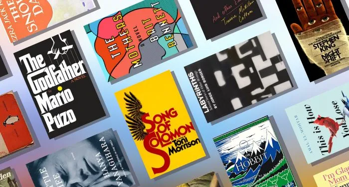
The Godfather by Mario Puzo
How recognizable is this cover design by S. Neil Fujita, with illustration by John Kashiwabara? So iconic that you can buy any number of T-shirts that spoof its design. To name a few, you can acquire a shirt to claim you are: The Rodfather (with a fisherman casting instead of marionette strings), The Dogfather (bones as marionette sticks), The Gabagool (for the fans of cured meats), or The Godmother (it’s pink).

Song of Solomon by Toni Morrison
Here’s a classic from R. D. Scudellari. His work makes bold use of typography. The O’s tucked up against the L sort of make a face. Toni Morrison’s name lacks the dots on the i’s. The stacked S’s make a visual play on the assonance of the sounds. The wings are a little angelic perhaps and nod to the biblical title. Overall, this design is less about reflecting the book itself and more about creating something akin to a recognizable logo that proclaims this book to be capital-I Important. Which, to be fair, it is.

Labyrinths: Selected Stories & Other Writings by Jorge Luis Borges
The cover of the 1964 paperback of Labyrinths from New Directions includes a photograph by Gilda Kuhlman on the cover. She was the Production Editor and Art Director for New Directions in the 1960s. This is one of my favorite books, and the cover is perfectly mysterious. I like that all at once it is sharp and curved, full of distinct shapes that form a curious collective. It merits being studied. It’s a perfect match for a book that’s always making you question reality.

Flowers in the Attic by V.C. Andrews
Talk about iconic! Milton Charles designed the paperback, whose silver foil-embossed cover has a die-cut hole representing the house’s attic. When the cover is opened, a full page painting called a stepback reveals the creepy family, illustrated by Gillian Hills. It’s lurid and voyeuristic in the best possible way. The rest of the Dollanganger series received a similarly iconic treatment. If you come across an old copy that has the cutout and the stepback — later printings don’t have the hole in the cover — you’re a lucky duck.

I Know Why the Caged Bird Sings by Maya Angelou
Janet Halverson designed this cover in 1969. Its simplicity is striking, and the colors are vivid. I’m no ornithologist, but I’m guessing the fork-tailed bird on the cover is a swallow. Maya Angelous read the Bible twice as a child, and incorporated Biblical mythology into her heartwrenching autobiography. The Bible uses swallows building nests near the sanctuary as evidence of God’s love. Plus, their agility in flight makes them a bird especially emblematic of freedom. It’s a lovely and fitting choice for this cover.

The Hobbit by J.R.R. Tolkien
Did you know this iconic cover of The Hobbit is Tolkien’s own work? You can read more about the changes to it over the years, but what a gem. The mountains are too pointy to be real. The runes hint at what kind of mythology we’re in for, and hey, don’t those birds look awfully big? Do you like this first cover the best, or did you prefer when they colored the sun in red?

Invisible Man by Ralph Ellison
Edward McKnight Kauffer, who designed this cover, was known mostly for his poster art. It makes sense, therefore, that this cover is so eye-catching. The face on the cover is bathed in both light and shadow. The way the light appears to be falling from above as well as the criss-cross over the face perhaps allude to the beginning of the book. In it, the unnamed narrator describes his underground room lit with electricity stolen from the city’s grid.

Tender is the Storm by Johanna Lindsey
A list of the most iconic book covers without a Robert McGinnis cover is no list at all, if you ask me. I had to choose this romance cover because it was ultimately too hot to handle! The first printing really has the hero’s buttcheeks hanging out like that. But the next one put a red starburst over his loins proclaiming the book a “coast-to-coast best seller.” McGinnis is known for long, leggy figures and dramatic scenes, and at age 96, he’s still working! Check out Hard Case Crime for his recent work.

Know My Name by Chanel Miller
Jason Ramirez and Nayon Cho designed this cover that makes excellent use of the elegant and classic Lydian font, which has been a popular choice for book covers in the past few years. The gold lines refer to the art of kintsugi, in which broken pottery is repaired using gold. This powerful image shows that in making her name public and telling her story, Miller’s trauma is part of her history, but certainly not all of her.

Jurassic Park by Michael Crichton
You know a book cover is iconic when it can be ported from book to movie franchise to theme park rides with ease. This cover by renowned designer Chip Kidd is a quintessential example of this. There’s a great episode of the Spark & Fire podcast about the creation of this cover. The image of Michael Crichton’s fax to proclaim “Wow! Fucking Fantastic Jacket” is not to be missed.

The Animorphs by K.A. Applegate
This whole series has unforgettable covers, predominantly designed by David Mattingly. First published in 1996, Animorphs quaintly shows what computer graphics were capable of, regarding digital morphs between images. These books traumatized a generation with their depiction of the horrors of war and the loss of innocence that comes with it. Aimed at kids on the brink of puberty, these book covers do a great job showing how scary and confusing it is to go through big changes.

The Mothers by Brit Bennett
There are those lamenting the “book blob” era of cover design, but I’m never going to be mad at bold, colorful covers. I think The Mothers, published in 2016, somewhat ushered in this era. With lines that perhaps suggest a human profile, or maybe not, Rachel Willey’s cover design eschews making an obvious and reductive choice for what motherhood looks like. The book explores the slipperiness of the concept as well. It’s an enigmatic and intriguing cover.

Night Shift by Stephen King
No cover more terrifying! This cover has haunted me since I was a child, and Dom Brautigam is responsible for this nightmare. (LeVar Burton is responsible for others.) The first printing had a cover showing the eyes floating against a blue background. That cover had holes cut where the eyeballs were, like Flowers in the Attic’s attic, so upon opening it, one witnessed the (shudder) bandaged hand. I’m sure that was a hell of a reveal, but I find the full hand image on the cover the iconically scary one.

The Snowy Day by Ezra Jack Keats
Maybe it’s a cop-out to include a picture book in this list, but this one’s cover really does a lot of work. With the traffic light, we are instantly placed in an urban setting, a rare sight in picture books when this was published. Meanwhile, the child looking at his fresh footprints in the snow evokes the sense of wonder snowy days create. Creating magic out of the ordinary is something children are so good at, and this classic book celebrates that.

A Little Life by Hanya Yanagihara
Talk about the line between pain and pleasure. This cover photograph by Peter Hujar is titled “Orgasmic Man,” in case you were wondering what’s really going on. Devoid of that context, it truly is impossible to say what the person on this cover is experiencing. Hanya Yanagihara’s books are for readers who, counterintuitively, enjoy books that will destroy them, so this image couldn’t be more appropriate.

A Farewell to Arms by Ernest Hemingway
A Farewell to Arms was the first work of fiction to be given the Penguin paperback treatment, and the iconic status of this design is quite undeniable. Only the general fiction in the series was orange, but that color certainly eclipsed the purple of essays and the green of crime novels, etc. Edward Young created the design, including the original penguin logo. That penguin has undergone changes over the years, and my personal favorite has a little roll of pudge and a jaunty foot in the air. What makes these covers so iconic is their collectability. They were color coded and numbered, making them something you wanted to line up on a shelf rather than discard.

I’m Glad My Mom Died by Jennette McCurdy
This book made a huge splash, partially due to its brash title, and I think also partially due to this genius cover design by Faye Orlove. The pastel colors and square-within-a-square design call up a nostalgia for ’90s books. It’s a little Baby-Sitters Club, a little Judy Blume. The same way people have nostalgia for iCarly. But the title undercuts that wholesome vibe entirely. The pink urn and Jennette’s bemused, indifferent expression is icing on a messed up cake. Truly unforgettable.

This is How You Lose the Time War by Amal El-Mohtar and Max Gladstone
This cover, by Greg Stadnyk, uses birds to represent Red and Blue, the time-traveling spies in this epistolary novella. They’re organic, but also a little glitchy. What a perfect way to show that even in a futuristic time war, the human desire to love and be loved cannot be denied. The cover is distilled to only these two characters, with no background detail, the way this novella takes such an expansive context to craft an intimate story.

Face Of An Angel by Dorothy Eden
As a die-hard lover of gothic literature, I had to include a “women running from houses” cover on the list of iconic book covers. It’s hard to choose a single cover to encapsulate this trend, so I picked one cover that includes many of the important features. This one, by Lou Marchetti, features a flowing white gown, a creepy castle/manor, and a conspicuously phallic turret with its light on. There are so many wild and wonderful variations on this theme, and we have other artists, including Victor Prezio, Elaine Duillo, Robert McGinnis, Walter Popp (no relation), George Ziel, Charles Geer, Renato Fratini, Allan Kass, and Harry Bennett, among others, to thank.

Thick: And Other Essays by Tressie McMillan Cottom
It’s rare for nonfiction book covers to get a lot of love, so let’s show some for this one, designed by Bookbright Media. As the author states in the book, “thick” is a descriptor in sociology to mean that a description is given plenty of context to situate it. The cover shows the other meaning of thick, with that wide H forming something like a torso whose figure is not an hourglass. It implies we will indeed be examining bodies and beauty standards. Thick is a work by a Black author whose work engages with race a lot. The stark black color centers that Blackness. Lastly, the handwriting look of the subtitle and author’s name lend a personal touch, letting us know not to expect stodgy academic prose.

Frankenstein by Mary Shelley
Of course Frankenstein has received countless covers over the years, some of them iconic in their own right. But I chose this one to recognize the amazing era of pulp covers. The early days of the pulp paperback included reprints of classic titles in cheaper editions. And plenty got pulped-up covers that were, like this one, a little misleading about the content. This art style is undeniably striking. While I couldn’t find the artist of this particular cover, some artists known for their pulped classic covers are James Avati, Mitchell Hooks, Charles Binger, Ken Riley, Stanley Meltzoff, and Tom Dunn.

Crazy Rich Asians by Kevin Kwan
I think this book cover, designed by Ben Wiseman, is iconic for similar reasons that I’m Glad My Mom Died is iconic. They both call to an entire genre of literature with their cover design. Unlike I’m Glad My Mom Died, however, this one embraces rather than subverts that genre. Giving the title and the author’s name nearly equal real estate on the cover calls up dishy books by authors like Jackie Collins, Judith Krantz, and Danielle Steel. The author’s name is meant to tell more about what you’re in for than the title does. With this cover design, Kevin Kwan joins the ranks of authors you associate with breezy but gripping poolside reading. This book promises to be rife with excess, drama, and plenty of name-dropped fashion brands.

A Princess of Mars by Edgar Rice Burroughs
Okay, so John Carter, the protagonist of this book, never took off as a cinematic franchise the way, say, Star Wars has. But tell me, how do we even have Star Wars without book covers like this? Anyone who’s lusted after Princess Leia in the gold bikini can thank artist Frank Frazetta. The way this 1970 cover blends sword and sorcery imagery with outer space imagery, in a pulpy style, sets a visual standard for an adventurous style of sci-fi. And you know a book cover is iconic when the original oil painting sells for $1.2 million at auction!

Shatter Me by Tahereh Mafi
The hardcover release of Shatter Me had a cover that was a little generic, if I’m honest. It was a girl in the gown, not hard to find in YA fantasy, in 2011. This paperback cover features art by Colin Anderson, inspired by a photograph by Sharee Davenport and cover design by Cara E. Petrus. Now we’re talking. Eyes are reliable for grabbing attention, featured on so many of these covers. This eye motif carries into the rest of the covers for the series, making them a cohesive and arresting set. But then the details pull you in. Mafi’s use of strikethroughs, as seen on the cover’s tagline, creates an instant turbulence challenging readers to discover the truth for themselves.

The Great Gatsby by F. Scott Fitzgerald
I don’t think this cover is iconic because everyone reads this book in high school. It’s iconic on its own merit, embodying the melancholy jazz age style found in the book. Francis Cugat designed the cover, and he was a true one-hit wonder in this field, as this was the only book he designed in his career. Fitzgerald describes Daisy as a “girl whose disembodied face floated along the dark cornices and blinding signs.” Turns out, he may have been inspired to write that by receiving early versions of the cover before the book was complete. It certainly would explain how the text and cover are so perfectly integrated.
I fully recognize that this list doesn’t get into all eras of book design. I’ll toss out there that I think yellowback books are iconic, I think mapback books are iconic, and I barely scratched the surface of genre fiction cover art. But I hope I’ve convinced you to broaden your scope when thinking about the most iconic book covers. Furthermore, do you think any of the best book covers from 2022 make the cut?


