Great Publisher Logo Designs: From Dogs to Olives
I was looking at a bookshelf not long ago, admiring a bunch of great spine designs (I posted a picture of some of them over on the Book Riot Instagram feed), and I had a sudden realization, an aesthetic aha! Many of us do pay attention to how book spines look, whether or not we organize our books by color. But there’s one element—one that’s on pretty much every book spine on every shelf—that doesn’t often get the attention it deserves: publisher logo designs. They’re rarely going to make or break the look of a spine (though I’ve seen some really ugly ones), but they can influence how a shelf looks and how it feels to pick a book off the shelf. In many cases, for example, they capture the mood of the publisher, giving you a clue about a book before you even pull it down: Is it elegant? Hip? Serious? Goofy? A little obscure?
Here are some of my favorite publisher logo designs, which divide themselves pretty neatly into categories: animals(!), typography, and objects.
ANIMALS
For some reason–maybe that animals and books just go together so well–a surprising number of publisher logos feature creatures.
Dogs (especially black dogs) are popular, though they can vary quite a bit. Sometimes they’re cute:
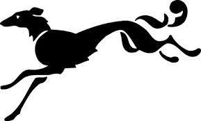
And sometimes they’re elegant (like Knopf’s fancy little Borzoi):
And sometimes they’re somewhere in the middle (like Graywolf and Tofu Hound):
Birds are also common choices. Penguins are nice, sure…
…but puffins always beat penguins in my book (ha, book!):
And then there are storks (or herons or whatever this is):
And a couple of of other publishers (like FSG and Particular) take animals and make them gorgeously geometric:
TYPOGRAPHY
Some of the loveliest publisher logo designs (and the ones that tell you right off the bat what kind of press you’re dealing with) are ones which put the name front and center, using typography as their primary design element.
For example, sometimes a fantastic font is all you need to say “This press is awesome in a very particular way”:
In other cases, doubling down on the name–“12” and “twelve”–is how you drive home the point of your press (publishing just twelve books a year):
These two academic presses (MIT and University of California) go typographical, but in a very different way. They’re cryptic and lovely, really making letters into design elements in themselves. The first, MIT Press, might just be my favorite publisher logo ever:
Sometimes, typography-forward designs still have room for other things, whether it’s adding an object-standing-in-for-a-word (as in Rocket 88) into the mix, a cartoon skyline wrapping itself around the press name, or a cutely elegant little star capping it all off:
OBJECTS
This last category is a bit of a catch-all, but they are united by making things a central part of the design.
Sometimes those objects are related to the press name (like Melville House and Two Dollar Radio):
Sometimes there’s a vague connection, like this vaguely book-ish design for Štampar Makarije:
And other times, they seem rather–and rather wonderfully–unrelated, like Other Press’s faces and Harper Perennial’s excellent olive:
 What logos look the best on your shelves? Which awesome logos have I missed?
____________________
Follow us on Twitter for more bookish goodness!


