

What Genres and Subgenres Should be Called, Based on Their Covers
If you spend time in libraries or bookstores, you’ve probably noticed book cover trends. Maybe you’ve picked up a book because its cover was unique or resembled another book. Maybe you like embossed gold covers or deckle edges.
Or you may think a lot of recent book covers look similar. Many 2020s literary fiction covers have titles in thick, all caps on a bright background. The Vanishing Half by Brit Bennett and Remarkably Bright Creatures by Shelby Van Pelt are two prominent examples of this style. Some readers love this style; some find it overdone or generic.
This 2022 article explains that book designers have difficult and seemingly contradictory tasks: making covers unique but simultaneously attractive to algorithms. Covers often contain hidden details but must also be attention-grabbing, even in thumbnails online. Fitting into an existing trend isn’t necessarily cliché. It’s creative marketing that helps readers find books.
Publishing trends can become memes. Social media users have compared food packaging to the fonts on Colleen Hoover covers. Many online book lists collect or parody the fantasy title format “A Blank of Blank and Blank.” Some covers of classic books contain blatant spoilers because designers think most readers already know the endings. So, here are some silly genre and subgenre names I made up to fit these cover trends.

Classics: Random Word Association!
Penguin Classics covers often feature beautiful paintings. I love Penguin’s paperback of The House of Mirth. This painting by Lilla Cabot Perry has the perfect style and tone. On the opposite extreme, some editions of classic books seem like they were designed by incorrectly guessing the books’ contents. I saw this trend years before AI programs were widely available, so it’s not only because of AI.
In this list of the worst covers of classic books, that’s Lady Godiva, NOT Lizzie Bennet, on the cover of Pride and Prejudice. My (least?) favorite example: A Modest Proposal, a satirical work about eating babies to reduce poverty, which this publisher apparently confused with a marriage proposal. No! Not that kind of proposal!

Romance: Illustrated People! Bonus Pastels!
Examples of this cover trend include The Spanish Love Deception, The Proposal, and The Kiss Quotient. Trends come and go. I remember more stock photos on romance novel covers years ago. Some readers hate the trend of illustrated, featureless characters on romance covers. Some love it. They may prefer to imagine characters’ appearances without photos of models or movie tie-in covers of actors.

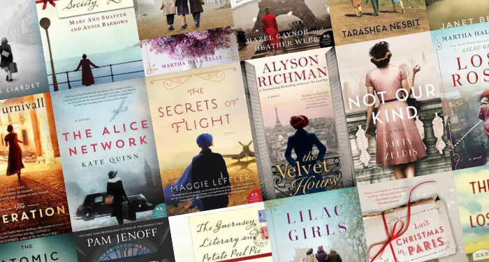
Historical Fiction: Characters with Their Backs to the Reader
This design trend has been widely documented for years — for example, when BR traced it from 2008-19. Like with the recent romance covers trend, it leaves the specifics to readers’ imaginations. It’s mostly found with historical fiction set in World War II and earlier, like Lilac Girls and The Guernsey Literary and Potato Peel Society. As opposed to …
Fiction about the 1960s: Groovy!
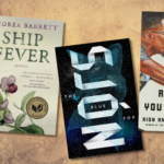
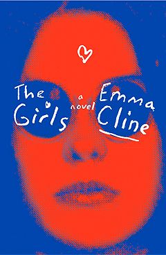
Novels set in the 1960s often feature psychedelic fonts and cover designs. I love Peter Mendelsund’s cover for The Girls by Emma Cline (left). The bold colors remind me of Andy Warhol’s images of Marilyn Monroe. Covers in this style evoke the era instantly, and I’m giving them their own entry because they fascinate me. A drawback: psychedelic covers often feature distorted shapes and letters and low-contrast or clashing colors, which can be difficult to read.
Nonfiction: Ordinary Objects But Symbolic!
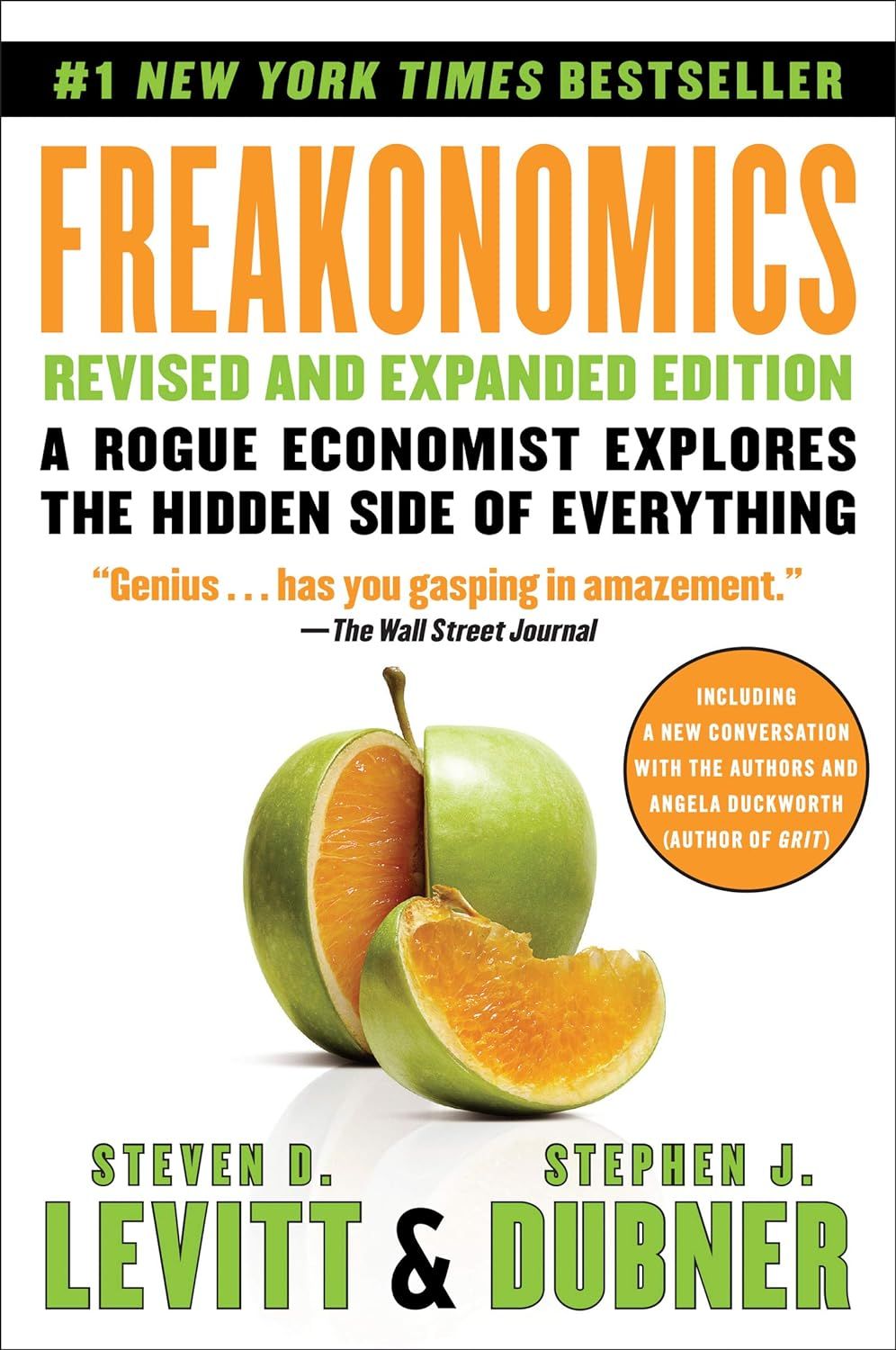
A single object on a nonfiction book cover can be memorable. Consider the match on the cover of The Tipping Point or Freakonomics‘s fruit with the flesh of an orange and the peel of a Granny Smith apple. The images fit these popular economics and social sciences books, which try to change how readers think of everyday things. Back in 2011, Cory Bortnicker created a (now defunct) Malcolm Gladwell Book Generator.
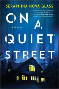
Thriller/Mystery: A House But Scary
This is not to be confused with haunted or Gothic houses in the horror genre. Yes, I could have picked many other trends, such as government buildings and symbols for legal and political thrillers. But for domestic and psychological thrillers, an eerily lit house or a person looking through a window evokes the threatening feeling that something is off. On a Quiet Street is pictured, but Amazon’s suggested titles contain many similar covers.
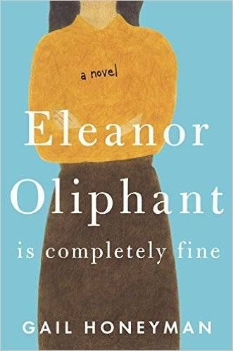
Literary Fiction: “Headless” Protagonists?
Yes, I know I mentioned lit fic in my introduction, but it’s such a broad term. Many books I read fall under this umbrella term, and the covers have intriguing micro-trends. Covers with heads obscured or cut out of the frame include Eleanor Oliphant is Completely Fine and Everyone in This Room Will Someday Be Dead. Interestingly, as Lacey deShazo wrote on Book Riot in 2018, covers with headless characters or obscured faces are not necessarily objectifying. They can represent mystery, a character’s insecurities and traumas, or the theme of identity.

Dark Academia: Greek or Roman Statues
Dark academia can be an aesthetic and a subgenre. According to many people, dark academia originated with Donna Tartt’s 1992 novel The Secret History. Mystery, slipstream, horror, fantasy, and more fiction genres can have dark academia elements. These novels often contain cults, revelries, and charismatic, murderous professors. Many are set in English and Classics departments at old, prestigious boarding schools, colleges, and universities. So, fittingly, books like The Secret History and The Maidens have classical marble statues on their covers.
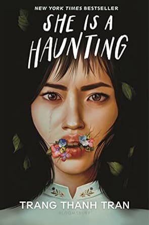
Horror: Surreal Faces!
I love the covers of She Is a Haunting by Trang Thanh Tran, illustrated by Elena Masci and designed by Thy Bui and Wilder Girls by Rory Power, designed by Regina Flath and illustrated by Aykut Aydogdu. Both are beautiful close-ups of faces that are somehow both surreal and hyperreal. I love that the artists use ribbons, geometry, flowers, and realistic details (and NOT racism, ableism, fatmisia, or sexism) to create body horror.
Do You Always Notice Book Covers Too?
Check out a hilarious take on creepy book covers, and don’t miss these terrible covers of classic books.