
Forever . . . A Judy Blume Cover Retrospective
Cover design is one of my biggest book world interests. I love thinking about the design process, from both the perspective of the creator and their work from that angle and the marketing and publicity angle—how do you create a cover that sells the book to the intended readership? We might proclaim that we don’t judge a book based on its cover, but every single person does just this. If we didn’t, we would never pick up a book, and money, time, and effort would not go into cover creation.*
Perhaps one of the most interesting aspects of cover art, though, is looking at its evolution through a single book. We get the opportunity to see trends emerge, right alongside seeing what was historically seen as catchy in terms of design. With new technology, the purpose of cover art has had to change. We no longer only encounter books in the physical realm. Now, covers need to both pop on shelves and as a tiny thumbnail for online retailers and look good in a propped setting for visual social media sharing (there has even been speculation that the growth in white walls in homes is partially because it helps influencers make products pop). We don’t like to think of books as products because we’re passionate readers, but they are just that. As products, they need to be sold. The cover is key.
An excellent example of cover evolution, one that both showcases changes in design trends and captures a particular sense of nostalgia, is none other than the classic teen novel Forever . . . by Judy Blume.**
Published in 1975, Blume’s YA novel follows Katherine, an 18-year-old high school senior, as she explores what it is to experience sexual intercourse. It’s a book that has been passed around since its publication and which has been challenged and banned for decades. For many, it was a book that first introduced them to the realities of heterosexual intercourse in a frank, honest manner.

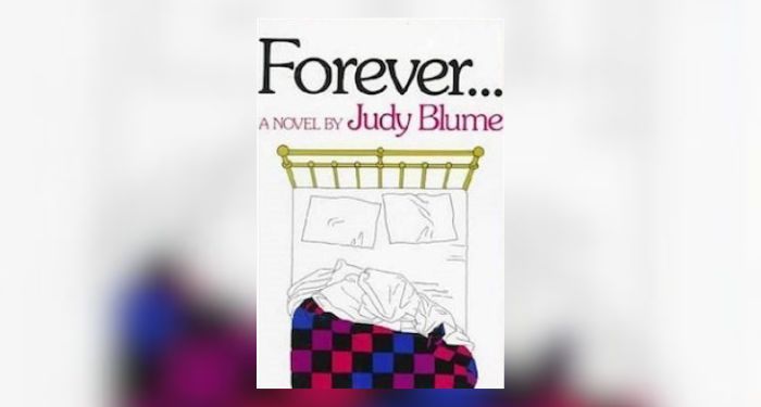
So how do you sell that? For the initial cover, it was pretty straightforward: a font-forward title with an image of a bed. The bed is straight from the book, brass with a “patchwork quilt” in purple and blue. The font used for both the title and byline is pretty in line with design trends of the time, as is the cover overall.

The covers above are from around the same period of time as Forever. It was common to see images of the teens in these YA novels right on the cover. This is where the initial design for Forever differed: we don’t see any teens at all.
Later that year, Forever came out in a new paperback edition.

The font is perfectly ’70s with its rounded edges. We get more text on this edition of the book, first to indicate who Judy Blume is and then in the form of a tagline: “A modern story of the end of innocence.” Spicy, no? The image itself goes in an entirely different direction than the original hardcover, offering a locket with the image of a girl’s face on the inside. She looks relatively sad here, or perhaps it’s wistfulness. This might be influenced entirely by the tagline. If there weren’t a “loss of innocence,” would she be sad, or would this look more like a girl in love? What is clever is the locket itself. In the book, it’s a gift to our main character, Katherine.
The hardcover and paperback tell two very different stories and sell to two very different audiences.
Let’s look at one more edition of the novel in the 1970s. Although we know 1975 and 1978 are only three years apart, you can already see the shift in design sensibilities when it comes to books for teenagers.

The font on this particular edition gives off romance vibes. And while there is romance in this book, I suspect it wouldn’t be cataloged as capital-R romance. But for teens, that design choice may have been intentional to signal that while this is a novel about the “end of innocence,” it’s a romantic one. Blume’s name has taken up more real estate here than in the prior editions.
Once again, we get the face of our heroine front and center. This time, though, her gaze is at the reader and not downward. The cover itself is far more colorful than its predecessors, indicative of a new and emerging trend in books for teens. The 1970s were a golden era, so it made sense that more attention was paid to selling the books to their readers.
Onto the ’80s.

A motif that will emerge as we move through the more recent editions of Forever is how many body parts represent the story on the cover. In this 1982 edition, we’ve got thin, light-colored fonts for the title and author. Then, we have two non-descript hands being held at the center. There is nothing distinguishing the two people, and the clothing is so basic as to be almost forgettable. The tagline for the book is gone.

In the ’80s, we also get this very pink cover featuring a closeup of a chest. It’s made less scandalous, of course, with the odd placement of a big yellow flower. There’s a new tagline, too: “It was first love. It was true love. But was it Forever…”. This is a completely different vibe than the initial tagline about the loss of innocence! Blume’s name is large and in charge on this edition, and we have the return of a necklace on this one. The necklace that Katherine receives in the story is a round locket, not an open heart, though.

It is worth considering Forever in context with some of the other YA book cover designs in this decade. The above are a handful, so not representative of everything, but we see commonalities in the font. What we don’t see are dismembered parts of a body. The whole teen gets to be on the cover, not just some part of them.
I struggled to pull out cover examples of how Forever looked in the 1990s, and even thinking about the edition I read as a kid, I cannot remember anything about it. One cover I could pull up that did not seem to have much information about it—it appears to be from the mid-’90s and maybe from the UK—was this one.

Like in one of the ’80s editions, the title and author take a backseat to the image at the center. We again have the locket without any images of the characters. There’s no tagline except for “a teenage classic.” At this point in the book’s journey, Forever earned that distinction.
Take a look at some of the covers of YA books from the ’90s. It’s interesting to see how much these book designs become more sophisticated as the decade goes on. The Face on the Milk Carton was published in 1990, while Monster came out in 1999 (alongside books like Laurie Halse Anderson’s Speak).

Perhaps no time was more evolutionary for Forever than the 2000s and 2010s when the book’s cover underwent several major changes. Many designers had the opportunity to work with the classic, and they each added something unique to it. First, though, one that may be more of a question mark than an exclamation.

If ever a book cover screamed capital-R romance, it’s this one. The envelope with red lipstick, paired with the tagline “There is a first time for everything,” gives the book such a different feel than in any of its prior iterations. Even the chest-focused cover from the ’80s isn’t as bold. The cover here seems not to be for teen readers but for adult readers. Published in 2007, perhaps the goal was to reach adult readers who may be feeling nostalgic for a classic they grew up with but with a package that didn’t scream, “This is a book for teenagers!”
Before this edition came a 2005 paperback to celebrate the book’s 30th anniversary. This cover is one I might be most familiar with, having purchased and revisited it for school and for myself.

Created by Carissa Pelleteri, this edition of the classic offers not only a return to body parts as the central images—two pairs of legs—but we are back to having an image of the bed. This bed isn’t the one we know to have a patchwork quilt, but the whiteness of the bed, the drapes, and sunlight in the back lean heavily into the idea of “innocence.” There’s also a new tagline alongside the thinner font of the book title and author: “Is there a difference between first love and true love?”
In a fascinating thesis from Kathleen C. O’Connell in 2010, the writer makes the observation that Forever’s cover evolution and focus on body parts has shifted downward over the decades. We began with the face of Katherine, then we moved to her chest, then onto a part of interlocked hands. Now, in the ’00s, we’ve moved down to the legs of both Katherine and Michael.
So when the 2014 new edition of Forever came around, it is in some ways surprising and refreshing to see the return to Katherine’s face being the focus of the book cover.

Not only do we have Katherine’s face, but we have Michael’s, too. There are two different fonts being used on the cover, including each being used for Blume’s name, which takes up nearly half of the real estate.
When these covers were announced and they caused quite a bit of discussion among the bookish internet—and the TODAY reveal is itself telling of how little time was spent looking at the cover’s evolution over the decades. Is this cover actually any more grown-up than others? Not really. It might be that it has been packaged to appeal to adults buying YA, as opposed to teens themselves.
There’s one last cover to talk about, and that’s the brand-new edition of Forever, published January 2, 2024. This one is maybe my favorite of all of the covers over the course of the book’s 40 years in publication. It might be kind of obvious why and why it is a cover that cannot be truly appreciated until you’ve looked at previous covers—and looked at them in context of the design trends of the eras in which they came.

The latest iteration of Forever harkens back to the original 1975 cover, but it stands out because it takes the classic look and gives it a contemporary spin. The patchwork quilt is a trendy checkerboard sheet set, while the brass bed is a more modern wooden one. We have the perfect ’70s font for both Blume’s name and the book title. What’s more, there are no body parts here. Instead, two bodies are represented by two sets of shoes strewn on the floor. The colors on this pop while also having enough of a soft hue that this cover would fit right onto the same shelf as the original edition without standing out too much. And yet, it also stands out among today’s book covers.
This is not by any means a comprehensive look at the covers of Forever, not even a wide survey of cover design trends by decades. There are several other interesting renditions of Forever in the US market—including this illustrated edition for the audiobook which saw its debut in 2021—as well as a host of international editions, too.
Instead, it looks at the ways design trends shift and change, what those design trends might say about an intended readership, and, well, a fun little romp down memory lane with a book that has been a staple in teen literature for nearly 50 years.
*Note: I’ve tried to track down and credit cover designers and artists where possible. It is still a difficult task, rendered more challenging when looking at covers from decades past. It is wild that in 2024, it’s still not standard for publishers to include designer information on the landing pages for their books.
**The ellipses after the title Forever . . . are part of the title. For the sake of writing, I’ve left them off through the rest of the piece.
Find more posts like this via our subscription publication, The Deep Dive! Weekly staff-written articles are available free of charge, or you can sign up for a paid subscription to get additional content and access to community features.