
Cover Art Comparison: US versus UK Editions
I often wish US covers looked more like UK covers. For example, US historical romance covers often feature a couple in a clinch, and emphasize the sexual element of romance, while UK covers are a little more evocative of the setting.
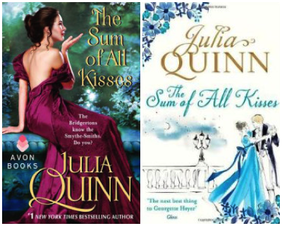
Julia Quinn’s The Sum of All Kisses is a pretty typical US historical romance cover, with a heroine in a disheveled gown. Both covers suggest a lighthearted love story but the UK presentation seems more artistic. They share ornate fonts that are typical of the genre. The US text connects this book to the author’s mega-popular Bridgerton series, but the UK text links Quinn to England’s own Georgette Heyer, who is credited for originating the Regency romance subgenre.
But it’s not just romance. Even though the US and UK share a lot of social similarities, their book covers are often quite different. I’m no authority on cover art, but these differences really caught my eye (the UK covers are on the right):
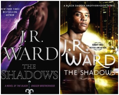
With The Shadows, paranormal romance/urban fantasy author J.R. Ward’s Black Dagger Brotherhood series finally gives readers protagonists of color. Which I think the UK version makes much more obvious. This was a lost opportunity, to my mind, when there are so few characters of color in PNR/UF. The cityscape UK cover emphasizes the urban in urban fantasy while the tattoos and weapons in the US cover emphasize the fantasy. I definitely prefer the font and composition of the US cover, though.
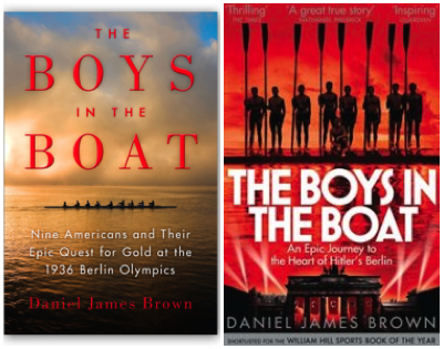
The US cover emphasizes that The Boys in the Boat is about American athletes while the UK cover refers explicitly to Hitler, both choices that make sense given their different audiences. I’m torn about which I prefer of these covers. The US cover is beautiful. I love the composition of the title, and the smaller image of the boat against the vast ocean and sky really communicates the “against all odds” nature of the 1936 American crew team’s Olympic accomplishment. Both teams are in shadow (probably because individual members are less important than what they achieved together), but the UK cover has the team brandishing their oars, looking defiant and powerful. The UK version also pictures the Olympic venue, again making that stronger connection to Germany as befits its history.

The US and UK covers for the paperback version to Andy Weir’s The Martian share a planet-appropriate color scheme but that’s about it. I prefer the US version because the dust storm communicates the novel’s sense of disorienting isolation. Besides, that guy’s not Matt Damon.
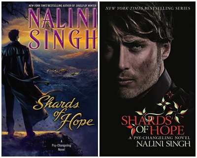
The US and UK covers for the fourteenth book in Singh’s urban fantasy Psy/Changeling series convey that the hero is a leader who commands respect for making tough choices in difficult circumstances. But the UK cover of Shards of Hope, with its “I’m dangerous but also awesome in bed” stare connects it to romance while the US cover looks more retro SF to me. The composition of the UK cover feels more balanced and I like the way its growing flowers symbolize hope.
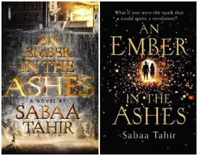
An Ember in the Ashes, Sabaa Tahir’s debut fantasy adventure novel, gets a more crisp and readable cover in the UK, but a more visually intriguing cover in the US. You have to really look to see both protagonists on the US cover. The US cover has a fiery title set against a mountain of ash, while the UK cover looks more cool and spacey. The tagline on the UK cover connects the book’s theme to The Hunger Games. For me, The more artistic US cover with its unusual color scheme wins.
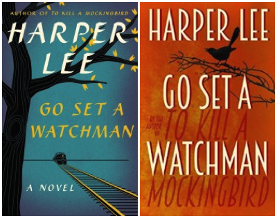
The cover of Harper Lee’s Go Set A Watchman could be all black and it would still sell a bajillion copies, but it’s interesting to see such different artwork for the US and UK audiences. The UK version highlights To Kill A Mockingbird more emphatically, with both a singing bird and the title of the classic mirroring the new book’s title. But the huge TKAM lettering, to my mind, almost sets up a competition between the new book and the old. The US cover offers a more subtle visual connection to TKAM with the tree and the 1960ish styling. The painterly font is almost the same as the first edition of TKAM, as is the composition with the tree on the left.
I think all of these covers do what a book cover should. They impart the basic information. They reflect what the book is about and indicate what the reader can expect. They all have a kind of emotional pull, whether it’s triumph, sex, love, danger, history, or the author’s own previous beloved work. Some attempt to be more original and eye-catching while others situate the book within its genre by using common cover conventions. Looking at US and UK covers highlights the way different things can be conveyed by a slightly altered image or font or tagline.
It’s amazing to me how one page of cover art can communicate important information and evoke a range of emotional responses about a book that’s hundreds of pages long. I’m super text-oriented, and with digital books, I often don’t even notice cover art. But whenever I stop for a second and actually look at a book cover, I’m reminded that authors aren’t the only artists in publishing.


