On Coloring Comics
Once a month, Gene Luen Yang, the National Ambassador for Young People’s Literature, stops by Book Riot Comics for Creativity in Progress, a minicolumn on art, process, and how he creates comics.
Gordon Yamamoto and the King of the Geeks #1 was the first comic I wrote and drew as an adult.
Shortly after I finished it, I was able to get Diamond Comics, the largest comics distributor in North America, to include it in their Previews catalog. They asked for a color image for the solicitation, but the friend who was helping me with the cover wasn’t finished yet, and the rest of the book was in black and white.
So I picked my favorite panel, opened up Photoshop, and gave comic book coloring a try.
A few weeks later, my friend Derek Kirk Kim (the cartoonist genius behind Same Difference) came over to hang out. I showed him the Gordon Yamamoto solicitation. He paused for a moment before turning to me in disgust. “Dude, their colorist totally ruined your art!”
Nowadays, I usually hire colorists for my projects. Derek was right. I have a terrible sense of color.
This even shows up in how I dress. More often than not, when I’m about to leave the house, my wife will stop me and say something like, “You cannot leave the house wearing that shirt with those pants!”
Every blue moon, I’ll still color a project on my own. It’s only when I’m desperate (i.e. all my friends are busy) and I never show Derek the results.
Most colorists I know use Photoshop. The tricky part of the process is “trapping,” which means the colors need to bleed a little bit underneath the black line art. This is a quirk of the printing process. The black is printed separately from the rest of the colors, and if the printer’s registers are a bit off, you’ll get a weird halo effect if the colors aren’t trapped.
Trapping can be done easily with a Photoshop plug-in called Flatten from peltmade. (Jason Shiga gave me that tip.)
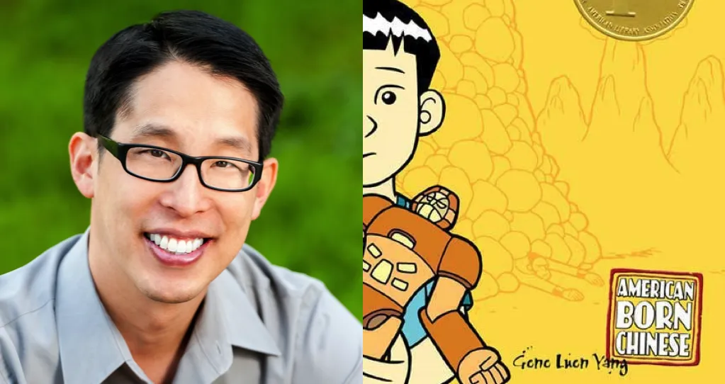
My friend Lark Pien is one of the most brilliant colorists in the industry today. (She also writes and draws her own graphic novels, like utterly endearing Long Tail Kitty). Lark colored both American Born Chinese and Boxers and Saints for me. At the beginning of each project, Lark and I sat down to talk over the themes of the story. Then Lark developed several palettes. She spent a lot of time picking out colors that both look good with together and express the theme.
The most rigorous project we did together was probably the Saints volume of Boxers and Saints. I wanted the Joan of Arc character to look ghostly without looking creepy. Lark created not just a palette for Joan, but a technique. I thought worked well. Our editor Mark Siegel disagreed. Lark and I looked around for inspiration, and we found it in these online images of illuminated manuscripts from the Middle Ages. Lark then developed a multilayered technique that gave Joan of Arc texture and depth and character. It was perfect.
As my dad can attest, a good colorist can breathe life into mediocre line drawings. When I showed him the finished pages of Saints, he said, “You know, son, I never thought you could draw that well, but Lark’s colors make it look like you can draw really well!”


