
The Origin of the Romance Novel Clinch Covers
This content contains affiliate links. When you buy through these links, we may earn an affiliate commission.
I love clinch covers.
There. I said it.
Whether it’s because I started reading romances back in the ’90s, and all the books I had access to were straight out of the ’70s and ’80s, or simply because I love me some dramatically painted images of billowing gowns and suggestive poses, I don’t know. But I love them.
Jon Paul Ferarra is my patron saint. I pray to him daily.
 I say a novena to the artists who came before, like the epically talented Elaine Duillo who painted Fabio into our hearts and onto our shelves. And to Robert McGinnis who painted the original cover for Johanna Lindsey’s Fires of Winter, which I love with all my blackened little heart.
When I hear people discussing getting rid of the clinch cover, I understand it, I do. I think they’re wrong, and I think a lot of the time their motives are based less in “progress” than in fear of being judged for reading a clinch cover in public. But I get it. Even Sarah Wendell of Smart Bitches, Trashy Books once wrote that “There’s a certain amount of professional image that one loses in a glance if there’s Fabio and a nameless model humperating on the cover of one’s lunchtime reading material.” Now, granted, that was back in 2007, and I don’t know where she stands on clinch covers now. Opinions change. But the shared mortification about having all those abs on display seems pretty widespread.
Again, I get it. I understand. But I just can’t agree.
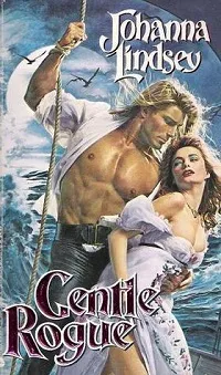 Because my clinch covers are my precious, excessive children and I love every single facet of them right down to the weird, period inappropriate green eyeliner on the heroine of Johanna Lindsey’s Gentle Rogue. (Really, this is the least of the weirdness to be found on a Johanna Lindsey cover, but I’m trying to inform, not terrorize with Fabio thigh.)
That’s not to say that the clinch cover doesn’t pose a problem for the romance community. After all, these decadent, Day-Glo masterpieces didn’t just appear. They were created; the idea of a couple embracing passionately on the cover occurred to someone, who then realized that idea would attract readers, and it is now so firmly entrenched in the cultural identity of the romance genre that every Ben or Bob thinks he knows what a romance novel is because he’s seen clinch covers in the book section of his local grocery store. And even people in the romance industry who want to are having a hard time eradicating the clinch.
So where did the clinch covers come from? And why were they made?
 In 1975, the editorial director of Playboy Press was Mary Ann Stuart. While previously the press published “male oriented fiction and nonfiction,” it was Stuart who went to her bosses with the suggestion that the company profit from the post–The Flame and the Flower (Kathleen Woodiwiss, 1972) fervor by publishing its own romances. Stuart’s decision to advocate for romances to Playboy management was one that would, like the publication of The Flame and the Flower, have a lasting effect on the romance genre.
Not only was the success of the Playboy line “pivotal” in “accelerating the [historical] sub-genre’s proliferation in the late ’70s” (Markert 51), but Playboy is also the reason that we still have gorgeous clinch covers, even today. The original cover of Playboy Press’s first romance, Proud Passion by Barbara Bonham, is somewhat tame aside from its vibrant blue color. But it is clear from the synopsis just where the novel fits into a post–The Flame and the Flower market: a travelogue plot, sending the heroine here and there on a perilous journey during which she meets with brutal men, and sometimes the hero is the most brutal of all. And so on and so forth in the ’70s single-title historical model. Which is probably why the 1976 novel sold like gangbusters! Proud Passion had to be reprinted more than once, and by the end of the year some half a million copies were in circulation.
With the confidence of Playboy management reassured by Bonham’s success, and the Playboy romance line well underway, Stuart turned her attention towards reinventing the outside of romances, the covers of which still reflected the old days of pulp Gothic romances and sweet historicals rather than the sexually liberated texts that romance novels were fast becoming. Most houses at the time were relying on adjectives in the synopsis to help readers recognize the new, sensual single-title historicals, rather than the cover of the novel (Markert 53), but Playboy needed something quicker. Something to catch the reader’s attention before they even started to read the synopsis.
 At its height, the company was publishing more romances than any other American press—by the time they sold to Berkley in 1982 they were up to 15 historicals a month. With a lack of time to spend promoting all their new authors, Stuart was looking for a better way to make Playboy romances stand out on the shelves and be easily recognizable to readers as sensual romances. What’s more, people looking for a new historical needed to be attracted to Playboy romances above all other lines.
And so the clinch cover was born. Bright, captivating, and instantly recognizable.
Markert claims that Playboy set the industry standard for covers for the remainder of the decade, and he’s right of course. But I would claim that Playboy’s clinch covers set the industry standard. Period. Because while the extraordinary clinches of the ’70s and ’80s were temporarily replaced by the flowers and landscapes trend for a short time in the ’90s, one look at a modern romance shelves reassures us that the clinch lives on. Like the new sensuality of romances in the ’70s, the clinch crossed sub-genre lines and changed the mode of romances permanently.
 These days the clinch has evolved alongside the genre to meet reader demands. There are still pectorals galore, and a lot of bare backs, but there’s a decided absence of heroines overspilling their bodices, or people who are entirely nude but for their strategically places love interests (I refer you back to the cover of Fires of Winter, as featured earlier in the article). It’s not that things have become tamer, necessarily. Witness the glorious Tessa Dare cover to the left, which is every bit as sensual as an old school clinch.
But it’s the tenor of the clinch covers that have changed. I can neither prove nor disprove the rumors that circulate that the clinch was originally designed to attract male readers to the genre. It’s difficult to find a source that can give you a definitive yea or nay on that motive. But the thrust-forward bosoms, uncomfortable positions, and tendency to nudity on some of the old covers suggests that maybe there’s some truth to the claim. And that’s a problem in a genre that is supposed to be all about and for women.
So maybe that’s why the new clinch covers feel softer to me. They range from sweet to sultry, but they seldom feel…gosh I hate to use the word “tawdry” because it has such a negative connotation. But yes, okay, the “this is pretty much my whole boob out” bodice and porn-mouth of something like Gentle Rogue does feel a little tawdry in comparison. (But oooooh how I love it.) Which is why I’m going to use Gentle Rogue as an example, and critique it with love for a minute.
 Here’s a good example of what I mean: Alisha Rai’s Hate to Want You is a very steamy cover. The color choices, the positioning, the sense of abandoned conveyed by the heroine’s tipped back head—but it doesn’t feel excessive. Nor does A Lady By Midnight (above). Maybe it’s because the details have been stripped back to leave only the couple, which creates an intimate but simple feel, and the impression that our couple is enjoying something private and personal (Rather than groping each other on an open ship deck—a questionable choice in such heavy seas…). Or maybe it’s that both couples are connecting with each other, whereas on the cover of Gentle Rogue he’s looking at her and she’s looking decidedly seasick.
What is more, clinch covers are no longer limited to sultry clutching, anymore than they are now limited to historical romance novels. A clinch cover only requires that the two leads be holding each other and engaging with each other. The pre-kiss, for example, is a popular but less heated version. As is the lift, which is featured in the gorgeous, oh so purple cover of Alyssa Cole’s A Princess In Theory. Still a clinch, technically. But one that maybe you wouldn’t mind reading in the lunchroom. After all, everyone’s still got their clothes on.
 So perhaps that’s the future of the clinch cover: evolution, not extinction. There’s no denying that, aside from the headless male torso, no cover style says “romance” like a clinch. But perhaps the compromise between those who love the clinch and those who hate it is a softer, less overtly sensual version in the future. After all, you look at A Princess in Theory and it’s clearly still a romance. There’s no question there, and recognition is really what the clinch cover has always been about. In the beginning, Stuart thought that meant very sexual covers because what defined the “new historicals” was their sexual quality, and readers needed to be able to spot that from a distance. These days readers want to “recognize” something a little different.
 I guess if I had one final thing to say it would be this: I hope the clinch never disappears entirely. Especially not if the only reason for driving it out of existence is that people who don’t even read romance might judge the genre harshly because of its covers. Yes, the clinch cover is widely mocked. But let’s be honest here. Getting rid of the clinch cover is not going to make people respect the romance more, because they have no desire to respect the genre in the first place. If someone is disparaging romance novels, it’s not because of all the fabulous pectorals on display on our covers. It’s because any book involving women and satisfactory sex is both repugnant to them and, at the same time, completely beyond their ability to comprehend.
It’s the text itself, not the wrapping, that ticks them off. So flip them off and go back to your reading, and long live the clinch cover.
 I say a novena to the artists who came before, like the epically talented Elaine Duillo who painted Fabio into our hearts and onto our shelves. And to Robert McGinnis who painted the original cover for Johanna Lindsey’s Fires of Winter, which I love with all my blackened little heart.
When I hear people discussing getting rid of the clinch cover, I understand it, I do. I think they’re wrong, and I think a lot of the time their motives are based less in “progress” than in fear of being judged for reading a clinch cover in public. But I get it. Even Sarah Wendell of Smart Bitches, Trashy Books once wrote that “There’s a certain amount of professional image that one loses in a glance if there’s Fabio and a nameless model humperating on the cover of one’s lunchtime reading material.” Now, granted, that was back in 2007, and I don’t know where she stands on clinch covers now. Opinions change. But the shared mortification about having all those abs on display seems pretty widespread.
Again, I get it. I understand. But I just can’t agree.
 Because my clinch covers are my precious, excessive children and I love every single facet of them right down to the weird, period inappropriate green eyeliner on the heroine of Johanna Lindsey’s Gentle Rogue. (Really, this is the least of the weirdness to be found on a Johanna Lindsey cover, but I’m trying to inform, not terrorize with Fabio thigh.)
That’s not to say that the clinch cover doesn’t pose a problem for the romance community. After all, these decadent, Day-Glo masterpieces didn’t just appear. They were created; the idea of a couple embracing passionately on the cover occurred to someone, who then realized that idea would attract readers, and it is now so firmly entrenched in the cultural identity of the romance genre that every Ben or Bob thinks he knows what a romance novel is because he’s seen clinch covers in the book section of his local grocery store. And even people in the romance industry who want to are having a hard time eradicating the clinch.
So where did the clinch covers come from? And why were they made?
Clinch Covers Then
One of my favorite books about the history of the romance genre, in particular the industry history of the genre, is John Markert’s Publishing Romance. It’s one of the most in-depth considerations of how the genre came to be that I’ve ever had the pleasure to read, and I encountered facets of the romance genre’s past that I’d never even heard a whisper of before Markert. Of all the facts, big and small, that I picked up, my favorite is still the story of the origin of the clinch cover. In 1975, the editorial director of Playboy Press was Mary Ann Stuart. While previously the press published “male oriented fiction and nonfiction,” it was Stuart who went to her bosses with the suggestion that the company profit from the post–The Flame and the Flower (Kathleen Woodiwiss, 1972) fervor by publishing its own romances. Stuart’s decision to advocate for romances to Playboy management was one that would, like the publication of The Flame and the Flower, have a lasting effect on the romance genre.
Not only was the success of the Playboy line “pivotal” in “accelerating the [historical] sub-genre’s proliferation in the late ’70s” (Markert 51), but Playboy is also the reason that we still have gorgeous clinch covers, even today. The original cover of Playboy Press’s first romance, Proud Passion by Barbara Bonham, is somewhat tame aside from its vibrant blue color. But it is clear from the synopsis just where the novel fits into a post–The Flame and the Flower market: a travelogue plot, sending the heroine here and there on a perilous journey during which she meets with brutal men, and sometimes the hero is the most brutal of all. And so on and so forth in the ’70s single-title historical model. Which is probably why the 1976 novel sold like gangbusters! Proud Passion had to be reprinted more than once, and by the end of the year some half a million copies were in circulation.
With the confidence of Playboy management reassured by Bonham’s success, and the Playboy romance line well underway, Stuart turned her attention towards reinventing the outside of romances, the covers of which still reflected the old days of pulp Gothic romances and sweet historicals rather than the sexually liberated texts that romance novels were fast becoming. Most houses at the time were relying on adjectives in the synopsis to help readers recognize the new, sensual single-title historicals, rather than the cover of the novel (Markert 53), but Playboy needed something quicker. Something to catch the reader’s attention before they even started to read the synopsis.
 At its height, the company was publishing more romances than any other American press—by the time they sold to Berkley in 1982 they were up to 15 historicals a month. With a lack of time to spend promoting all their new authors, Stuart was looking for a better way to make Playboy romances stand out on the shelves and be easily recognizable to readers as sensual romances. What’s more, people looking for a new historical needed to be attracted to Playboy romances above all other lines.
And so the clinch cover was born. Bright, captivating, and instantly recognizable.
Markert claims that Playboy set the industry standard for covers for the remainder of the decade, and he’s right of course. But I would claim that Playboy’s clinch covers set the industry standard. Period. Because while the extraordinary clinches of the ’70s and ’80s were temporarily replaced by the flowers and landscapes trend for a short time in the ’90s, one look at a modern romance shelves reassures us that the clinch lives on. Like the new sensuality of romances in the ’70s, the clinch crossed sub-genre lines and changed the mode of romances permanently.
Clinch Covers Now
 These days the clinch has evolved alongside the genre to meet reader demands. There are still pectorals galore, and a lot of bare backs, but there’s a decided absence of heroines overspilling their bodices, or people who are entirely nude but for their strategically places love interests (I refer you back to the cover of Fires of Winter, as featured earlier in the article). It’s not that things have become tamer, necessarily. Witness the glorious Tessa Dare cover to the left, which is every bit as sensual as an old school clinch.
But it’s the tenor of the clinch covers that have changed. I can neither prove nor disprove the rumors that circulate that the clinch was originally designed to attract male readers to the genre. It’s difficult to find a source that can give you a definitive yea or nay on that motive. But the thrust-forward bosoms, uncomfortable positions, and tendency to nudity on some of the old covers suggests that maybe there’s some truth to the claim. And that’s a problem in a genre that is supposed to be all about and for women.
So maybe that’s why the new clinch covers feel softer to me. They range from sweet to sultry, but they seldom feel…gosh I hate to use the word “tawdry” because it has such a negative connotation. But yes, okay, the “this is pretty much my whole boob out” bodice and porn-mouth of something like Gentle Rogue does feel a little tawdry in comparison. (But oooooh how I love it.) Which is why I’m going to use Gentle Rogue as an example, and critique it with love for a minute.
 Here’s a good example of what I mean: Alisha Rai’s Hate to Want You is a very steamy cover. The color choices, the positioning, the sense of abandoned conveyed by the heroine’s tipped back head—but it doesn’t feel excessive. Nor does A Lady By Midnight (above). Maybe it’s because the details have been stripped back to leave only the couple, which creates an intimate but simple feel, and the impression that our couple is enjoying something private and personal (Rather than groping each other on an open ship deck—a questionable choice in such heavy seas…). Or maybe it’s that both couples are connecting with each other, whereas on the cover of Gentle Rogue he’s looking at her and she’s looking decidedly seasick.
What is more, clinch covers are no longer limited to sultry clutching, anymore than they are now limited to historical romance novels. A clinch cover only requires that the two leads be holding each other and engaging with each other. The pre-kiss, for example, is a popular but less heated version. As is the lift, which is featured in the gorgeous, oh so purple cover of Alyssa Cole’s A Princess In Theory. Still a clinch, technically. But one that maybe you wouldn’t mind reading in the lunchroom. After all, everyone’s still got their clothes on.
 So perhaps that’s the future of the clinch cover: evolution, not extinction. There’s no denying that, aside from the headless male torso, no cover style says “romance” like a clinch. But perhaps the compromise between those who love the clinch and those who hate it is a softer, less overtly sensual version in the future. After all, you look at A Princess in Theory and it’s clearly still a romance. There’s no question there, and recognition is really what the clinch cover has always been about. In the beginning, Stuart thought that meant very sexual covers because what defined the “new historicals” was their sexual quality, and readers needed to be able to spot that from a distance. These days readers want to “recognize” something a little different.
Final Thoughts
Where am I going with this? Nowhere, really. I’m not trying to convince you to give up disliking clinches if they make you uncomfortable. Nor am I trying to suggest that there isn’t any reason to reconsider the clinch as it currently exists. As in all things there’s always room for improvement, and romance covers have a way of evolving right alongside the genre itself. I guess if I had one final thing to say it would be this: I hope the clinch never disappears entirely. Especially not if the only reason for driving it out of existence is that people who don’t even read romance might judge the genre harshly because of its covers. Yes, the clinch cover is widely mocked. But let’s be honest here. Getting rid of the clinch cover is not going to make people respect the romance more, because they have no desire to respect the genre in the first place. If someone is disparaging romance novels, it’s not because of all the fabulous pectorals on display on our covers. It’s because any book involving women and satisfactory sex is both repugnant to them and, at the same time, completely beyond their ability to comprehend.
It’s the text itself, not the wrapping, that ticks them off. So flip them off and go back to your reading, and long live the clinch cover.


