
24 of the Best 2024 Book Covers So Far
I’m obsessed with book covers. I always have been and always will be. Keeping an eye on book cover trends continues to be a role I do not take lightly, as I use some of the insights I glean to contextualize the annual Best Book Covers of the Year posts.
Book cover design is interesting because it’s got to play to some trends, got to play to some conventions of genre and age category, and because it’s got to play to consumer tastes. We need book covers to sell a book — it’s the number one marketing opportunity for any title. But we need those covers to also give insight into the story and to be nice to look at and to be easy to render on mobile.
Important to all of this is the team behind the cover’s creation. For too long and still to this day, cover designers and artists are rarely credited for their work. The time it takes to find this information is embarrassing in 2024, and still, many of the covers you’ll see below don’t have this information available. Publishers still don’t put it on the landing pages for these books, so it takes good Googling and a lot of luck to dig up names to credit. Unfortunately, this also makes it easier for AI-generated art to get through to book covers, which we have already seen this year.
I’ve pulled together here 24 of the most compelling, interesting, creative, and clever book covers so far for 2024. These are all books that have hit shelves already, so it’s not forward-looking. As noted, I’ve done my best to credit artists and designers, and those without are not left off as a slight. For the sake of space, time, and, well, because this is a post about book covers and not necessarily the book contents, I’ve not posted descriptions of the books but short thoughts on what makes the cover stand out. You can grab the book description by clicking the link.
These covers are only for adult novels. There are certainly whole posts with 24 more rad covers for YA books and middle grade books and children’s books, and so on. Something noteworthy and that has been in the back of my mind over the last few years related to cover designs: short story collections get some of the best art and design.

Alphabetical Diaries by Sheila Heti, with cover design by Na Kim
As straightforward as this cover might seem at first glance, it stands out because of how straightforward it is. There is nothing here but the title and author in what is a fairly basic font. Yet the styling is just different enough to make it pop. The clever coloring of ABC here only emphasizes the title (and the book contents itself).

American Spirits by Russell Banks
This cover captures an American spirit in a simple yet effective manner: the signs that we encounter every single day. We’ve got three stacked atop one another that lay out the book title and author in an eye-catching manner. The imperfection makes it perfect.
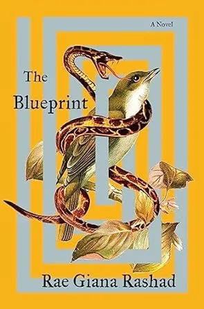
The Blueprint by Rae Giana Rashad, cover design by Robin Bilardello
There are a lot of elements in The Blueprint’s cover that I know I have seen before. There’s the boxy style, the weaving of a snake around several elements, and even the color feels familiar. But all of the pieces together make it unique — even the oddly shaped leaves somehow work here, perhaps because they throw off that “seen it before” feeling. Snakes are so common on covers for certain genres, so seeing it here is also kind of unexpected — and this snake isn’t especially huge, but I sure do worry for that bird.
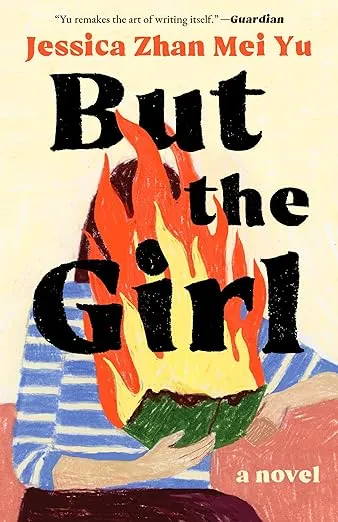
But The Girl by Jessica Zhan Mei Yu
This cover is different from its original Australian cover, and it’s also more compelling. The crayon drawing style is unique, and the imperfections of that style make it pop. The book is definitely too small for that amount of fire, but somehow, it works. Where the title wouldn’t capture my attention, the cover certainly does.
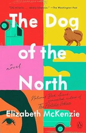
The Dog of the North by Elizabeth McKenzie
This cover isn’t for the original hardcover, which you can peep here. This is the paperback redesign that hit shelves this year which cleverly incorporates every element of the original hardcover into it. But instead of a pale background, this one goes bold and splits the cover not in half — this is a trend as of the last couple of years, to have one half of a book cover with one color or style and the second half, a different one — but into sixths.
I like this take on the cover split up slightly more than the one for Dolly Alderton’s Good Material, but that one is pretty eye-catching, too.

The Emperor and the Endless Palace by Justinian Huang, cover art by Yixin Zeng
This is a romantasy novel and is being marketed precisely as that. But the cover for Huang’s novel looks so different from the titles also being marketed that way. This one is bright, animated, and energetic — it leans way into fun fantasy by way of a romantic fever dream.
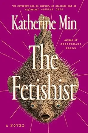
The Fetishist by Katherine Min, cover design by Stephanie Ross
When you pair the title of this book with the expression on that fish, you have a winner from the start. But the magenta background with the brown fish and off-white font choices and the cover truly do tell a whole dang story alone. What could be a static and forgettable cover is rendered energetic with those carefully and thoughtfully placed diagonal lines.
This cover reminds me a little bit of Ned Beauman’s Venomous Lumpsucker.
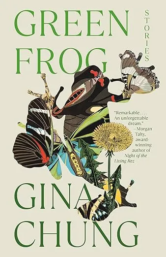
Green Frog: Stories by Gina Chung
The frog isn’t green. There is green within the frog, but that frog is far more complex and nuanced than the title might lead you to believe. There are several caterpillars within that frog’s body, as well as at least two moths (I believe them to be moths here rather than butterflies, but I’m willing to be wrong). Some of the stories in this collection explore body horror, and what could be more horrifying than entire other creatures growing and evolving inside you? The positioning of the frog here gives the cover so much dimension and depth — we’re going to see this design decision show up again.
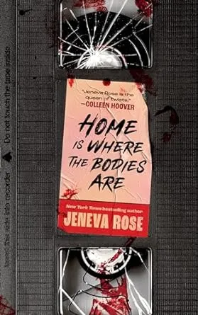
Home Is Where The Bodies Are by Jeneva Rose, cover design by Sarah Riedlinger
Book covers that look like things that are not book covers hit a sweet spot with me. I love that this book looks like an old VHS — which is a key element in the story itself. Rose’s book isn’t the only horror title this year getting the VHS treatment. Check out the cover for Paul Tremblay’s Horror Movie. I’d put Rose’s cover right alongside This Will Be Funny Later by Jenny Pentland, which is a VHS case.

I Love You So Much It’s Killing Us Both by Mariah Stovall, cover design by Jack Smyth
There’s something about the poppies against the grayscale background that makes this cover quite literally pop. The placement of the title and its uneven kerning only adds to it. The clouds and ground are literally crushing the title.
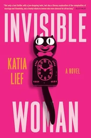
Invisible Woman by Katia Lief
Is it the bold pink cover? Sure. The pink author font? Yes. But mostly, it’s the kit-cat clock in the middle of the bold pink cover. This is a clever thriller, and the cover conveys that perfectly — this book is not going to be what it looks like from the outside.
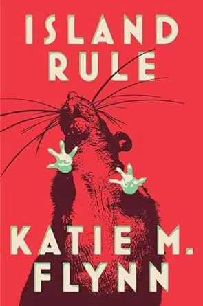
Island Rule by Katie M. Flynn, cover design by Adriana Tonello, art direction by Rodrigo Corral and Lisa Litwack
Recall the perspective of the frog on Green Frog a few covers up? This cover gives very similar vibes, but instead of a frog, it’s a rat. I love the rat’s cream-color paws that match the title and author font. There is very little happening on the cover, and yet, because of how little is happening, there is so much going on.

The Kamogawa Food Detectives by Hisashi Kashiwai, trans. by Jesse Kirkwood
A lot of the covers in this roundup lean Literary, but that’s not to say there are not incredible covers for genre reads. You’ve seen a couple already and you’ll be seeing some more below. I love this sweet kitty cover for a cozy culinary mystery that’s been a huge hit in Japan. The cover gives all of the vibes the story has, and I don’t know about you, but I’m ready to pick it up immediately.

Love and Hot Chicken by Mary Liza Hartong
This book cover gives off southern U.S. without being stereotypical. The sunflowers give you the season when this story would be set, and the title placed on the side of the bright red barn is reminiscent of what you’d expect to see at a hole-in-the-wall eatery in the south. This is a queer story of friends, family, and hot chicken, packed with humor and heart.
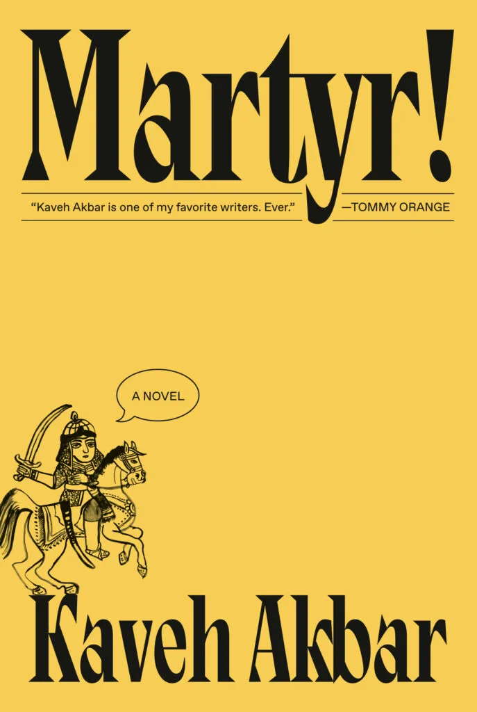
Martyr! by Kaveh Akbar, cover design by Linda Huang
This is not the cover you’d expect for a literary novel about an orphaned son of Iranian immigrants — but it’s kind of the perfect cover for that story when it is a story that also incorporates humor and a look at what it is to be a martyr and creative. The huge title, with a small blurb make it unique in a sea of book covers where blurbs from others can too easily become the focal point, is refreshing. So, too, is the cute little illustration. The martyr saying, “A novel?” I love it.
The cover here is an excellent example of a pretty standard design principle, which is the “6”. The human eye tends to start looking at an image from the top, often the top right (despite reading left to right). There we have the exclamation mark. The eye then moves toward the left corner, where we have our little illustration. The eye then skims the bottom and circles back to the left corner. There’s our little martyr again. It’s a basic principle for a reason: it can be used so effectively, as it is here.
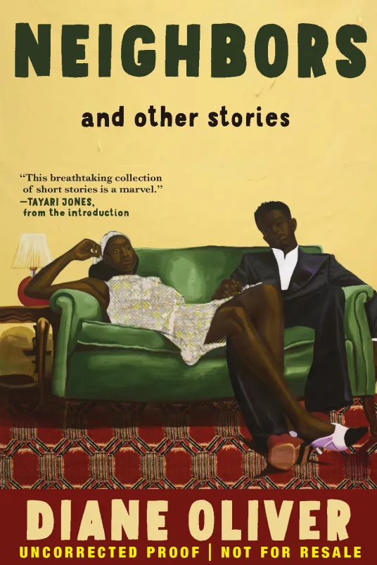
Neighbors and Other Stories by Diane Oliver
I don’t care for illustrated covers in part because they all look so similar and too many flooded the market. This one, however, takes the illustration and exaggerates it just enough to make it both look realistic…but also hyperrealistic. The couch here is a nice grounding place for the cover, and on that couch are two people who may be neighbors but whose neighborliness is maybe slightly more. The contrast between our individual on the right with a suit and the short dress on the character on the left stands out, too. I want to know who they are and what their story is.

On Being Unreasonable by Kirsty Sedgman
This is another example of one where the paperback edition hit shelves in the first part of 2024, and its cover was stronger than the original hardcover. In the case of On Being Unreasonable, how nostalgic is this angry little bunny? It gives me ’70s and ’80s childhood vibes and connects with the theme of the book itself so well.
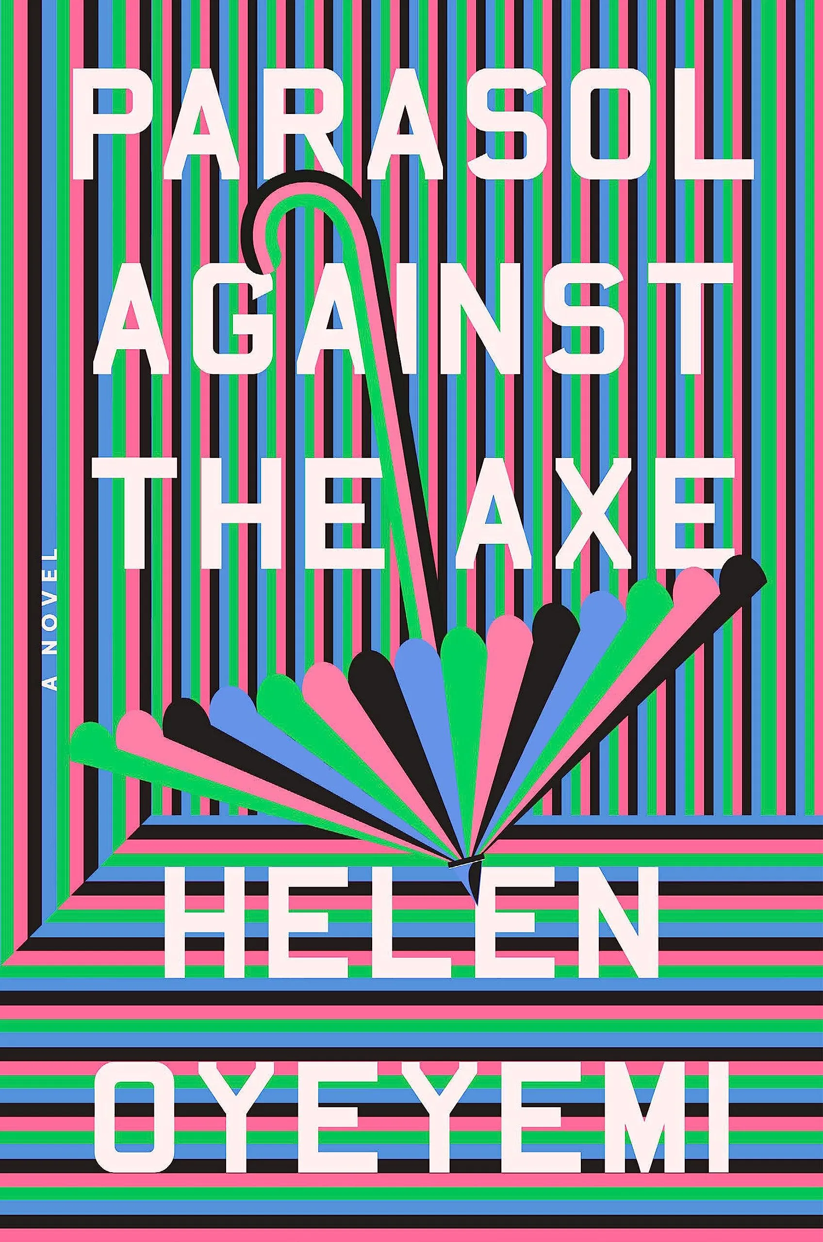
Parasol Against the Axe by Helen Oyeyemi, cover design by Grace Han
In a world of cover design that is afraid to truly stand out, this cover goes in the full opposite direction. Can you spot the parasol here, or is it like one of those 3D eye puzzles you did as a kid? The energy level here is off the charts — and that’s a good thing. This book is supposed to be a little odd itself, so the cover seems like the perfect fit for it.

Plastic by Scott Guild, cover design and art by Tyler Comrie
Bubble-style letters are having a moment (have you seen the monogram necklaces with them like these?). It should not be surprising to see it pop up in cover design, and I suspect this is not the first nor will it be the last. But what makes Plastic rise above is that it just fitst the title, the millennial pink coloring plays like a neutral here, and the actual image within the letters just feels, well, plastic. This cover is simple but extremely effective because of that simplicity.
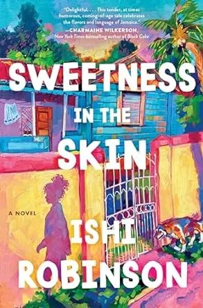
Sweetness in the Skin by Ishi Robinson, cover art by Alai Ganuza
If your first thought seeing this was, like mine, that it looked like an oil painting, then you’ll be pleased to know it is exactly that. Ganuza is an oil painter, and she did this cover for Robinson’s debut. This is a vibrant and energetic cover, but it doesn’t read as perfect or unflawed, either — something is slightly off, or else there’d be no story worth telling.

Tell by Jonathan Buckley, cover design by Janet Hansen
Repeating titles down the front cover of a book is nothing new. It’s kind of dated, really, given that when font-driven covers became the new staple around 2015-16, that led to it becoming so common you didn’t even notice you were missing actual art on covers (some were great, of course, but many became mostly unmemorable). This takes the repeating title in a different way and to good effect. The three-dimensionality here makes the cover and title memorable, and you don’t actually miss having art on that cover. The pastel color palette works, too, though it would be interesting to see this in a brighter or starker palette.
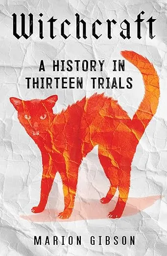
Witchcraft by Marion Gibson, design by Sarah Bibel
A good and effective cover does not need to reinvent the wheel. There’s actually nothing special going on here, but the black cat turned orange gives this one pop. (Of course, bonus points are awarded for the witchy font choices).

Women! In! Peril! by Jessie Ren Marshall
As you may have noticed, one of the things that makes a book cover really work is that it leans into a style. Sometimes it’s a fresh take on a familiar style — see the animal covers here or the covers for genre titles. Other times, it’s a type of style we simply don’t see a whole lot of on covers — an oil painting, for example, or in the case of Marshall’s book, pop art. The colors are electric, the woman’s expression (even without any facial features) is clear, and the use of exclamation marks is fun (and reminds me a lot of the Jessie Ware disco album title from last year, That! Feels Good!). I don’t know much about the book and purposefully did not read the description because enough is going on here to suggest this short story collection is up my alley.
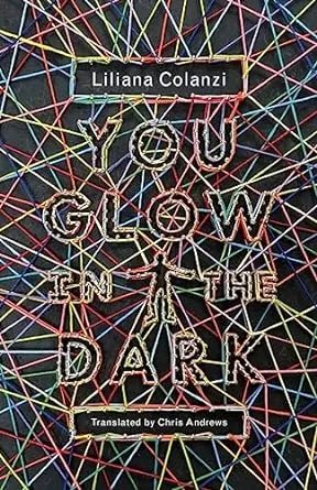
You Glow in the Dark by Liliana Colanzi, trans. by Chris Andrews, with cover art by Jamie Keenan
The earlier commentary on taking a familiar design and turning it on its head? That’s precisely what this string art cover for You Glow In The Dark does. It reminds me a lot of The Sun Is Also a Star (done by Dominique Falla) or The Color Master (also Falla) covers, but instead of going colorful string on white, it takes the colorful string and puts it on black, giving it that glowy effect.

Your Utopia by Bora Chung, trans. Anton Hur
Bora Chung has gotten excellent covers for her short story collections. For Your Utopia, we not only get a yellow cover — rare enough — but we get a robot that is clearly Not Well (those red lights pulsate even without any animation!). Something is awry here, and while I want to know what through the stories, I also don’t want to be in this guy’s way.
If you’ve paid close attention, then you’ll know there are more than 24 covers here. I could not make a single cut. Moreover, there were other titles on this list that I did cut because I figured 25 was a reasonable count beyond 24, but 30 was not.
I hope some of these covers piqued your interest not only in their design but in their contents, too. I know my TBR unintentionally grew.
The comments section is moderated according to our community guidelines. Please check them out so we can maintain a safe and supportive community of readers!


Leave a comment
Become an All Access member to add comments