Discover the Foundation of Manga Art Styles
Our love for manga keeps growing and growing. No surprise, really. We’re finally slowly shaking off the bias held against comics, manga, and graphic novels, giving us the freedom to enjoy the luscious art and the entertaining stories available. But between you, me, and my manga collection, there is something extra special about manga art styles. There is something so quintessential about manga, and most people can easily differentiate between manga and other comic book art styles. That’s mostly thanks to Studio Ghibli. However, that also means most mainstream audiences think Studio Ghibli is the only manga art style.
Sure, we all love the wide-eyed humans brimming with welled-up tears, their single-line facial features softened around the edges. There’s no mistaking the pastoral energy and wholesome colour palettes giving us warm feelings in our tum-tums. I am a huge Studio Ghibli fan…but there is so much more to manga art styles.
There are, in fact, many manga art styles — and you’ll start recognising them in the list below. But for the sake of time, I have only included seven of the most recognisable styles. Call me a child of the 1980s (you’re right). Call me a manga nerd (partly right). Call me slack for never finishing my TBR pile yet still looking for the next great manga (rude…but also right). The truth is, there is so much great manga out there, I’m merely trying to help you with the foundation styles. And it’s a solid foundation upon which to build your manga collection. Let’s do this.
Chibi – Cute and Small
It’s cute. It’s small. And most kids who want to create manga often start with the Chibi style because it is fairly easy to imitate. Chibi, as a manga art style, appeals to children and the young at heart (my great-grandmother would have LOVED Chibi). It’s all about looking young and small and cute. While not the most famous example of the art form, Chibiusa from Sailor Moon definitely brought it to the foreground. Her name, Chibiusa, is actually a nickname to differentiate her from the older Sailor Moon: Chibi (‘small person’) and Usagi (her given name). The point of chibi is to make everyone look younger than they are.
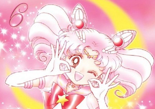
Chibi is often grouped with two other manga art styles: Kawaii and Kodomo. While they each share similarities, Chibi is the more exaggerated of the three. It is a true play on ‘Is Small. Is Cute.’ Kodomo is aimed at kids and families, with the inclusion of adult characters but within very kid-friendly storylines (e.g., Pokémon). Kawaii, on the other hand, uses the same big eye and cute features but with less detail in the scenery and a 50/50 chance for an adult-only storyline. You may have seen the term moe used in kawaii manga. Moe is the use of art to evoke an emotional response to a character. It is not always sexual but can be very tokenistic or stereotyped.
Realistic
Hyperrealistic art is usually associated with JoJo’s Bizarre Adventures, but it has been around a lot longer than that. My favourite example of this manga art style is in Fist of The North Star by Buronson, with Tetsuo Hara as the illustrator. It was very popular during the 1980s, with a clear homage to Bruce Lee in the early 1970s. Realistic as a manga art style is aimed at older audiences, embracing darker themes and often trying to capture the cynicism that comes with old age. There is an air of brooding, deeper attention to detail, and a darker colour scheme to settings.

Big Eyes (the Tezuka Effect)
Astro Boy is one of the most influential manga of all time (and if it’s not Number-One-Ichi-Ban, then it’s at least in the Top 3). One of its legacy features is the Big Eye manga art style. Tezuka always intended for his primary protagonist to have a youthful image, with an air of innocence in contrast to his more aggressive physical design.
Big eyes mean big innocence, and for a lot of manga artwork this has remained true. Take My Hero Academia for example. Deku captures everything Tezuka intended for Astro Boy, while All Might’s eyes are smaller and sharper, with the cynicism of adulthood. If you want to learn more about Tezuka’s manga art style, we covered it all in our celebration of Astro-Boy’s 70th anniversary here.

The Horror and The Paranormal
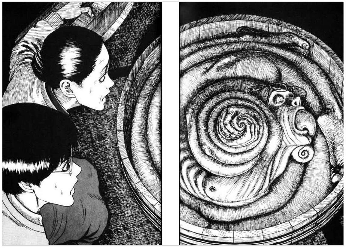
There is plenty to read in the horror genre, but no one really captures the truly horrific art style like Junji Ito. Ito’s style straight-up freaks me out. I can appreciate its beauty and simplicity. It is perfect for the horror and paranormal genres. I totally get it. But *shudder* I do not like the heeby-jeebies. Where Ito’s style for drawing humans in our most general form is really nothing special, there is something magical in the way the horror elements feel like they ooze off the page. Ito’s most popular manga series is Uzumaki, a supernatural story about a town’s obsessions and paranoia with spirals. Spirals are a common symbol used by Ito, giving a sense of disorientation which heightens the fear and anxious feelings. It’s a great place to start if you want to explore the best of the best horror manga art styles.
Shōjo style
There’s something about ‘Magic Girls’ that is so instantly recognised as a manga art style. Usually referred to as ‘Shōjo style’, it’s a rather broad style but frequently seen across the Shōjo genre. Thanks to the mangaka legend Moto Hagio, the Shōjo style grew in both popularity and influence during the 1970s. In The Heart of Thomas, Hagio was inspired by Jojōga, an older Japanese art style often used to create an aesthetic based on sad longing. She brought her romantic art style into the mainstream, creating a male-male romance drama that provoked emotions through art.
Hagio’s influence has continued through Shōjo manga. You can easily pick it from the heart-shaped faces: big sparkly eyes at the top and pointy chin at the bottom. Think Sailor Moon and you’ll never unsee it again. For more about Shōjo Manga, check out this guide to 12 of the Best Shōjo Manga.

Dragon Ball Shaped Heads
Best known for Dragon Ball, Toriyama developed a personal manga style that worked even better in anime. You can see the trend in his character design with the RPG Dragon Quest, especially with the oversized, weirdly shaped heads. The bodies tend to be heavily muscled, including the face with strong brows and jawlines that stretch out to the ears. Many people think of it as Dragon Ball style when really Toriyama simply made it his own.

And the Introduction of Colour
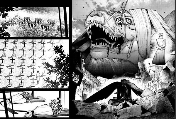
Traditionally, manga is black and white. There is shading and unique ways to play with light, maybe even a bit of toying with smooth single lines and the illusion of movement. But then there is Sui Ishida. Ishida’s artwork is standout stunning. Most manga critics often give Ishida his own art style category due to the use of colour and palettes in his work. However, this does not pay enough respect to the detail in lighting, the softening of edges and the depth of facial features. The use of watercolours, especially in Choujin X, adds a layer of gloominess to the dark fantasy vibes.
Of course, this is just the beginning of your dive into manga art styles. You can learn even more with books for learning how to draw manga styles. The best way to learn is to do, and Vernieda has a fantastic list of Manga Drawing Books, including Manga in Theory and Practice by Hirohiko Araki, creator of the hit manga series Jojo’s Bizarre Adventure.


