


Don’t Judge a (Comic) Book by Its Edges
Let’s admit it: we all judge books by their covers. Put me in a bookstore and I behave more like a child at Toys ‘R Us than a well-educated adult looking for her next intellectual fix (“Pretty colors! I like animals! That character looks awesome”).
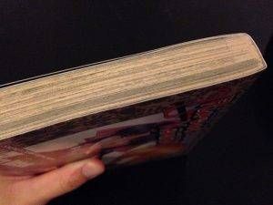
Even page edges can affect our assessment of a book. Gilded hardcovers seem important and rare (even if they’re an inexpensive copy of Shakespeare’s complete works); lurid colors on vintage paperbacks make us think of busty molls and the hard-eyed men who love them or menace them. With comic books, where the goal is to fill the pages with lines and tones much less predictable than a typeface, an indication of what’s inside can bleed right to the edges.
I started thinking about this a few days ago when I realized that I can always find the “Sojiro’s origin” flashback in Rurouni Kenshin simply by glancing at the tops of the books on my shelf. The manga trope of blackening page backgrounds to indicate a flashback can have dramatic effects on the book’s appearance.
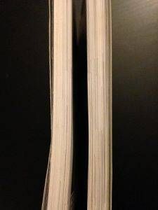
In some cases, page edges can reveal a shift or growth in the art style. Slicing Nimona down the middle shows us the increasing experimentation of the artwork:
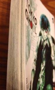
Other books can belie a publisher’s tricks. Tokyo Ghoul is marketed with mostly white or bright-colored covers, but a glance at its edges reveals the truth: this series is dark.
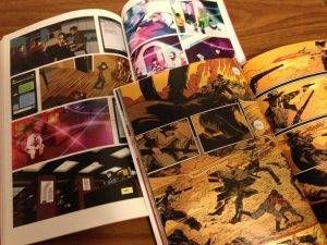
Disparities in edge appearance are especially striking among color comics: compare Pretty Deadly, volume 1 (top) and Sex Criminals, volume 1 (bottom).
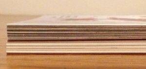
Although a single random spread of Sex Criminals actually uses more colors than Pretty Deadly, its art is (ironically) cleaner, sectioned off by neat white borders and margins that prevent the action from riding off the edge of the page. Pretty Deadly, set in a mythical Wild West, simply can’t be tamed.
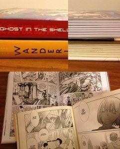
But as I pulled more and more comics, I discovered that most graphic novels offer extremely limited, and sometimes misleading, hints about the interior art. Ghost in the Shell and Wandering Son are both divided into neat chapters from the outside, but a quick glance at the inside dispels any assumption of similarity. Ghost in the Shell’s hard lines and dense dialogue drop us into a sci-fi police procedural; Wandering Son, the story of two transgender Japanese preteens, appropriately uses fewer spot blacks and larger areas of gray tone.
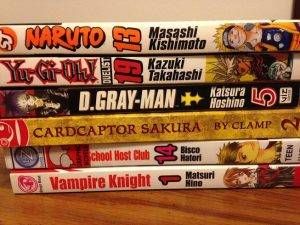
I decided to throw another variable into the mix: target audience. I was especially curious to test this with manga aimed at preteens and teenagers, since that represents a large chunk of what I read and I’m well-versed in their artistic languages. Shonen (boys’) manga favors bold lines and detailed action sequences, while shojo (girls’) manga tends to focus on emotional landscapes, conveyed with effusive use of delicate screentone, close-ups of wide-eyed faces, and pronounced negative space. I grabbed three shonen books and three shojo books from my shelves and stacked them on my kitchen table to see if I could categorize them based only on their page edges.
My guesses were, from top to bottom:
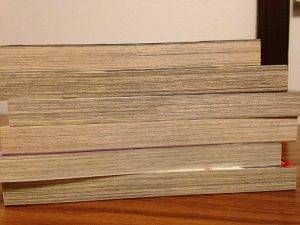
- Shojo
- Shonen
- Shonen
- Shojo
- Shojo
Answers:
- Shonen
- Shonen
- Shonen
- Shojo
- Shojo
- Shojo
I think it’s these little cues that keep me interested in print comics, even as digital access gets easier. Handling the physical book can become part of the artistic experience, in ways not even the artist could necessarily anticipate.


