


Out and Proud vs. Hiding in Plain Sight: The Evolution of YA Book Covers
Today is The Human Rights Campaign’s National Coming Out Day, and to celebrate we are spending the day featuring LGBTQ+ voices. Enjoy all the posts here!
A couple of years ago, I noticed a funny trend in book covers of YA novels featuring lesbian protagonists: the vast majority of them featured a weird focus on hands. Clasped hands, almost-touching hands, reaching-out-longingly hands. I dubbed it “lesbian hands” and wrote a tongue-in-cheek blog post about it, which, to my surprise, received a lot of attention. Not only did I hear from a lot of readers about how absurd they thought the trend was, but I received messages from editors and authors asking if they could use the post in sales and marketing meetings. “Please!” I responded.
 When I wrote my original blog post, David Levithan’s Two Boys Kissing had been out for about a year. It was a milestone cover for it’s very literal depiction of the title. It was a cover that said, “This is us, out and proud.” I wanted to see covers like that for YA books featuring lesbian romances. I advocated for them, and so did many readers and writers I know. And… they have appeared! Slowly, but they exist. Sarah McCarry’s About a Girl features two girls kissing, and Robin Talley’s upcoming novel, Our Own Private Universe, focuses on the faces of two girls smiling joyfully and leaning into each other in a way that screams romantic intimacy.
Victory for the queer girl books, right?
Except…
 I wouldn’t have gone near those books if I had seen them when I was a teen, let alone read them. In fact, I seriously question whether they’d even appear on the shelves of my conservative high school library today. Despite the many victories for LGBTQ+ rights in recent years, the reality is that coming out isn’t always safe for some teen readers. Or maybe it’s not the right time. Maybe some teen readers are still questioning themselves, and aren’t ready to answer outside questions. Maybe those teen readers need these books, but they can’t pick them up because doing so would inadvertently out them to others, or invite unwanted questions and opinions, or even put them at emotional or physical risk.
This new consideration inspired me to take a closer look at the lesbian hand cover trend, and some of the considerations that authors and publishers (but mostly publishers) have when creating these covers. How are they approaching these covers, and what, if anything, has changed in the last two years?
 Kekla Magoon’s 37 Things I Love (in no particular order) appeared in my original lesbian hands post, and not only is it a terrific book, but the cover is bright and fun. It shows an actual scene from the book, in which characters Ellis and Cara (who have a romantic connection) go swimming. Magoon told me, “even though they’re holding hands, [the cover] doesn’t look too specifically lesbian. Plenty of people have been surprised by that aspect of the content.”
 In fact, because romance isn’t at all the main focus of the plot, Magoon added, “I personally would not have wanted the covers to be any more explicitly romantic. The love interest is one aspect of the story, but to me it’s not a romance-centered narrative.” In this instance, the cover was subtle, but it might have been misleading for readers expecting a light, romantic story. When the novel went to paperback, it underwent a cover change. The paperback edition features another scene from the novel, Ellis on the swings at night. She’s alone, indicating that the story is more about her solitary emotional journey as she comes to terms with her father’s impending death, but the heart motif is a small nod to the theme of love (platonic, familiar, and yes, romantic).
 Jaye Robin Brown’s Georgia Peaches and Other Forbidden Fruit is the story of an out lesbian teen who moves to a conservative small town and grapples with her sexuality, religion, and a new crush. In discussing the evolution of her cover, Brown said that the initial cover concept was very similar to her final cover image. “At first I was hesitant because it was such a literal translation of the title and I asked if they couldn’t incorporate more of the story, specifically to show the sketchy profile of two girls facing in from the sides, like a line drawing,” Brown told me. The resulting image ended up looking too young, so the design team went back to the original drawing. “It didn’t escape any of us that the cut fruit was subtly suggestive and that it might not be the worst thing.”
And subtlety with a hint of suggestiveness seems to be what covers with queer content depend on, and why the lesbian hand trend is so pervasive. In regards to the original cover of 37 Things and a lesbian love story, Magoon said, “I think you have to really want it, in order to see it that way up front.” This subtlety worked for Brown, too, but in a slightly different way. “I do think that it’s a book that can sit face-out with the most nervous of booksellers or librarians, which is the best situation for the teens who need the book now.”
As a bookseller who has defended the presence of certain YA books on the shelves from upset parents, I appreciate the subtle approach for what it can accomplish in places where adults are quick to challenge content. Queer readers learn to look for the subtle signs that a book may be queer (Book Riot has a handy guide for those of you who are curious), but why should it be so hard to find the books? And what sort of message is being sent when queer teens can’t see visual evidence of their identities on the covers of books, but straight couples abound?
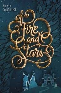 One of my favorite covers of 2016 strikes the perfect balance between out and proud, and subtle. Audrey Coulthurst’s upcoming YA fantasy Of Fire and Stars has a striking cover, but the first thing you notice is the beautiful title treatment, not the illustration of two girls, ironically, holding hands. A castle and the flame-like texture surrounding the title give the cover depth as well. Coulthurst told me that early on she requested that the design team stay away from the “girl-in-a-dress trend” and lesbian hands trend. She also expressed a desire for a cover that demonstrated there was a romantic relationship between the two girls, but acknowledged that marketing might see it as a risky move.
Coulthurst added, “The first concept they gave me had the two girls standing back to back, which I liked, but thought they could do more with. So I asked if the girls could either face each other or be touching. I wanted there to be some indication that there was a relationship between them, even if it wasn’t immediately evident that it was romantic. They ended up changing it so the two were holding hands.”
 Coutlhurst was ultimately pleased with all of the elements of her cover, and I think readers will be pleased as well. It’s a gorgeous fantasy cover that is on trend without looking too similar to anything else in the market, and the illustration of the protagonists is perfect because I think it re-envisions a common image of female lovers clasping hands behind their backs (and the backs of their male significant others). The girls on the Of Fire and Stars cover have their backs together, yes, but rather than seeing it as an allusion to sneaking around, I interpreted the pose as a show of solidarity. They have each other’s backs in the story, figuratively and literally. The cover is a beautiful representation of their story.
The Of Fire and Stars cover is not only a lesbian hands cover I can get behind, but I hope it’s an example of how a tired trend can be used in a more relevant way. Magoon said, “I like the idea of there being books about gay kids that don’t presume that sexuality is always going to be the dominant story thread. I also like for there to be books that look at the issue of coming out in more nuanced ways.” I wholeheartedly agree with her, and I hope that the covers become as nuanced as the stories. When it comes to marketing these books, there’s certainly more than one angle to approach from and hopefully publishers consider the myriad of options before going for the obvious cover trends. And as Brown so brilliantly puts it, “Hopefully, as we continue to evolve, all the cute couples can be front and center.”
I might not have been able to check out or purchase a Two Boys Kissing or About a Girl when I was a teen, but I would have seen those covers, marked them in my mind, and I would’ve felt reassured that they existed. And then I would’ve been thrilled when I stumbled upon Georgia Peaches and Other Forbidden Fruits, 37 Things I Love (in no particular order), and Of Fire and Stars. We need all sorts of covers for all sorts of readers, for every step in the coming out process.